Watching real people try to use your website is one of the most powerful things you can do to improve it. This process, known as usability testing, goes far beyond what your analytics can tell you. It uncovers the why behind the numbers, showing you exactly where users get stuck, frustrated, or confused.
It’s about closing the gap between how you think your site works and how it actually works for a first-time visitor.
Why You Can't Afford to Skip Usability Testing
Let's get practical. You see a high bounce rate on a key product page in your analytics. What do you do? You could guess—maybe the price is too high, or the images aren't good enough. But guessing is expensive and often wrong. Website usability testing replaces guesswork with direct observation.
Imagine you watch a recorded session of someone trying to buy from your site. They add an item to their cart, but then abandon it. Why? Because you got to see them spend a full minute hunting for a guest checkout option that was buried in a tiny link. That's not just a data point; it's a lost sale with a clear, fixable cause. These are the moments where revenue disappears and customer trust erodes.
Seeing What Your Dashboards Can't
In a competitive market, a seamless user experience isn't a luxury; it's a necessity. The only way to truly understand that experience is to watch it unfold. You’ll witness the slight hesitation before a click, hear the audible sigh when a form field doesn't work as expected, and see the precise moment a confusing navigation label sends them down a rabbit hole.
This kind of direct feedback is undeniable. It gives you a clear, prioritised list of what to fix, based on real human behaviour. This principle is a cornerstone of building products people love and aligns with established software testing best practices that focus on ensuring technology truly serves its users.
To get started, it helps to break down the core elements you'll need for any test.
Core Components of a Usability Test
This table outlines the essential pieces you need to consider before you begin. Think of it as your pre-flight checklist for a successful usability study.
| Component | Description | Example |
|---|---|---|
| Participant | A real person representing your target audience. | A university student testing a new online textbook platform. |
| Scenario | A realistic situation that provides context for the task. | "You've just moved house and need to find a new internet provider." |
| Task | A specific action you want the participant to complete. | "Find the 100 Mbps fibre plan and add it to your basket." |
| Metric | A measurable outcome to gauge success or failure. | Time on task, task completion rate (%), number of errors. |
Getting these four components right is the foundation for gathering meaningful, actionable insights from your tests.
A Strategic Move for Your Business
Treating usability testing as just another box to tick for the design team is a huge missed opportunity. It’s a strategic activity with a tangible return on investment. Every obstacle you remove is a direct boost to your key business goals.
A better user experience leads to happier customers. Happier customers are more loyal, spend more, and tell their friends about you. It's a simple, powerful cycle.
This isn't just theory. For businesses in the UK, this is a crucial part of digital optimisation. Imagine a company selling high-end hiking gear. They might ask avid walkers to test their new website, asking them to find a specific type of waterproof jacket. By tracking how quickly they succeed (or if they give up), the company gets hard data on what's working and what isn't. This is how you make decisions that genuinely reduce bounce rates and build a loyal customer base.
This process is absolutely critical when you're making big changes. In fact, we stress the importance of user feedback as a core part of our own website redesign checklist to ensure the new site actually performs better than the old one.
Ultimately, usability testing is your most direct line to understanding what it's like to be your customer. It turns cold data into human stories, giving you the clarity you need to build a website that doesn’t just look good, but also drives real, sustainable growth.
How to Plan Your First Usability Test
Jumping into website usability testing without a solid plan is a recipe for disaster. You’ll end up with a pile of vague opinions instead of the actionable insights you actually need. The truth is, the quality of your prep work directly dictates the quality of your results.
First things first, you need to set sharp, measurable goals. A fuzzy objective like "see if the website is easy to use" is a non-starter. It won't get you anywhere useful. Instead, think about specific outcomes. A much stronger goal would be something like, "Can a first-time user find our returns policy in less than 60 seconds?"
This kind of precision forces you to define what success actually looks like. Are you aiming to reduce the time it takes to complete a task? Increase the completion rate? See fewer errors? Getting your objectives crystal clear turns a casual poke-around into a proper, focused experiment.
Crafting Realistic User Scenarios
With clear goals in hand, it's time to build out realistic scenarios and tasks for your participants. These shouldn't read like a dry set of instructions. They need to reflect the real-world situations and motivations that bring people to your site in the first place.
For example, instead of just telling someone to "click on the jackets category," give them some context. Try this: "You're planning a hiking trip for next month and need a new waterproof jacket. Have a look on our site, find one you like, and add it to your basket." This small shift provides a purpose, making the whole interaction feel much more natural.
Here are a few more examples to get you thinking:
- For an eCommerce site: "Your friend’s birthday is next week. Find a gift for under £50 and add it to your wishlist to save for later."
- For a service business: "You need to book a consultation. Find the online booking form and schedule an appointment for next Tuesday afternoon."
- For a SaaS platform: "You've just signed up for a trial. Your first job is to create a new project and invite one team member to collaborate."
The best task scenarios feel like a real problem the user is trying to solve. This encourages natural behaviour and reveals genuine usability issues, rather than just testing a user's ability to follow instructions.
This visual guide from Nielsen Norman Group breaks down the core planning process, from setting your objectives all the way to establishing a timeline.
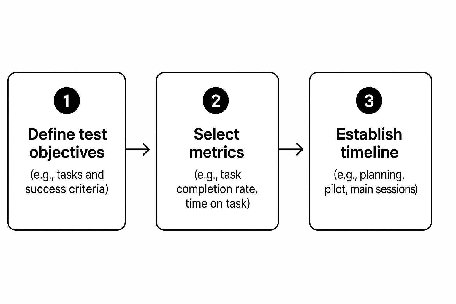
As you can see, connecting clear metrics to your objectives is a crucial step. It’s what ensures your test will produce data you can actually measure and act on.
Recruiting the Right Participants
Your test is only as good as the people you test with. It’s absolutely critical to recruit participants who genuinely represent your target audience. If you test with the wrong crowd, you risk "fixing" problems your real customers never had.
Take a moment to picture your ideal customer. Are they a tech-savvy millennial or an older adult who’s less comfortable with websites? A small business owner or a student on a budget? Sketching out a simple user persona can be a huge help in guiding your recruitment efforts.
Effective Recruitment Channels:
- Dedicated Platforms: Services like UserTesting or Userfeel are brilliant for this. You can filter for participants based on very specific demographic and psychographic criteria, making it the fastest route to qualified testers.
- Social Media: A quick post on your LinkedIn, Facebook, or Instagram channels can work wonders. This is a fantastic way to reach people who are already engaged with your brand.
- Email Lists: Your existing customer or newsletter list is a goldmine. These are real people with a vested interest in seeing your product improve.
- Customer Intercepts: For a more "guerrilla" style, you can use a pop-up on your website to ask visitors if they’d be willing to take part in a short test, usually in exchange for a small discount or voucher.
Choosing Your Testing Environment
Finally, you need to decide where your testing will happen. This choice often comes down to your budget, timeline, and how deep you need to go with your feedback.
A moderated test, which can be done in-person or remotely, involves a facilitator guiding the participant through the tasks in real time. This method is excellent for digging into the "why" behind a user's actions, as you can ask clarifying questions on the spot.
On the other hand, an unmoderated test is where participants complete tasks on their own while their screen and voice are recorded. This approach is much more scalable and budget-friendly. It allows you to gather feedback from a larger, more diverse group of users very quickly and is perfect for validating broader behavioural patterns.
With your objectives, scenarios, participants, and environment locked in, you have a solid plan. The last piece of the puzzle is to draft a clear script that guides the session without leading the user, ensuring the feedback you get is as authentic as it gets.
Choosing the Right Usability Testing Tools

With a solid plan in hand, your next big decision is picking the right tools for the job. This isn't just a technical choice; the platform you go with will dictate your budget, timeline, and even the kind of insights you can unearth. It's less about finding a tool with the most features and more about finding the one that perfectly aligns with what you need to learn.
The market is flooded with options, and your decision will likely hinge on a classic trade-off: do you need the sheer scale of unmoderated testing, or the rich, detailed feedback that comes from a moderated session? Getting this right is critical for gathering data you can actually act on.
Unmoderated Testing Platforms
Think of unmoderated testing tools as your go-to for gathering feedback quickly and at scale. These platforms let you send tasks to a large group of participants who complete them on their own schedule. You get screen and audio recordings of their journey, offering a direct look into how they interact with your site without you having to be there.
The biggest win here is efficiency. You can collect data from dozens, or even hundreds, of users across various demographics in a few hours. This makes unmoderated testing incredibly cost-effective. It's brilliant for validating design ideas, spotting widespread behavioural patterns, or just getting a quick sanity check on a new feature before it goes live.
Platforms like Userfeel have become popular for exactly this reason, enabling teams to get video feedback from real people without the logistical headache of scheduling live sessions. Many now even use AI to analyse recordings, highlighting common issues and saving you hours of manual review.
Moderated Testing Software
Moderated testing, on the other hand, is all about the deep dive. These tools are essentially purpose-built video conferencing platforms, like Zoom or Microsoft Teams, but supercharged with features for researchers. Think integrated note-taking, automatic transcription, and easy ways to create highlight reels of those "aha!" moments.
This approach is perfect when you need to understand the why behind a user’s behaviour. During a live, one-on-one session, you have the freedom to:
- Ask spontaneous questions when a user gets stuck or looks confused.
- Probe deeper into their thought process and expectations.
- Build a genuine rapport that encourages more honest feedback.
The real magic of moderated testing is the ability to have a conversation. When a user hesitates and says, "That's not what I expected," you can immediately follow up with, "Interesting! What were you hoping to see there?" This uncovers subtle insights that an unmoderated test would almost certainly miss.
Of course, even the best testing can't fix a poor foundation. The quality of your site's core structure is paramount. For a deeper look, check out our guide on what makes a good website design.
Comparison of Usability Testing Methods
Choosing between moderated and unmoderated testing can be tricky. Both have their place, and the best choice depends entirely on your project's goals, timeline, and budget. Here’s a quick comparison to help you decide which path is right for you.
| Method | Best For | Pros | Cons |
|---|---|---|---|
| Moderated Testing | Deeply understanding user motivations, testing complex prototypes, exploring sensitive topics. | – Rich, qualitative insights – Ability to ask follow-up questions – Builds user rapport |
– Time-consuming and expensive – Smaller sample sizes – Requires a skilled facilitator |
| Unmoderated Testing | Validating designs, identifying broad usability issues, getting fast feedback on specific tasks. | – Fast and cost-effective – Large sample sizes – Access to diverse demographics |
– Lacks deep context – No ability to ask clarifying questions – Risk of low-quality participants |
Ultimately, the methods aren't mutually exclusive. Many experienced teams use a hybrid approach, starting with unmoderated tests to identify problem areas and following up with moderated sessions to understand the nuances.
All-in-One and Hybrid Platforms
Recognising that most teams need a bit of everything, a new breed of all-in-one platforms has emerged. These tools don't just stop at user testing; they often integrate website analytics, heatmaps, surveys, and other research methods into a single interface.
For instance, you might spot a high drop-off rate on your checkout page using a heatmap. With a hybrid platform, you could immediately launch an unmoderated test targeting that specific page to figure out why users are leaving. By connecting different data points, you move beyond just knowing what is happening to understanding why, making your website usability testing efforts far more strategic and impactful.
Running the Test and Capturing Quality Feedback

This is the moment of truth. After all the planning, you’re finally sitting down to watch a real person interact with your website. This is where theory gives way to reality, and you gather the raw, unfiltered feedback that will actually make a difference.
How you manage this interaction is everything. Your job is to create a space where the participant feels comfortable enough to be brutally honest. That’s how you get to the good stuff.
Facilitating a Moderated Session
If you’re running a moderated test, think of yourself as part host, part quiet observer. You're not just there to read a script; you're there to build a quick rapport and guide the session gently, without steering the ship.
Always start by putting the participant at ease. I make it a point to explain that we’re testing the website, not them, and that there are absolutely no wrong answers. A simple reassurance that their honest feedback—good or bad—is exactly what we need can completely change the dynamic of the session.
Once the test is underway, your most powerful tool is the think-aloud protocol. You need to actively encourage them to say whatever is on their mind as they navigate the site. A simple prompt like, "What are you thinking now?" or "Talk me through what you're looking at here" can be incredibly effective.
Your main job is to listen, not talk. You have to fight the urge to jump in and help if they get stuck. Those moments of struggle are pure gold—they're where the most valuable insights live. Watch where their mouse goes, listen for a sigh of frustration, and take note of any hesitation.
When you do need to probe, use open-ended, non-leading questions. This is a skill that takes a bit of practice to get right.
- Avoid asking: "Was that button confusing?" (This plants an idea in their head).
- Instead, try: "I noticed you paused there for a second. What were you expecting to happen?"
This neutral phrasing lets them explain their thought process without feeling like they did something wrong, giving you far richer qualitative data.
Analysing Unmoderated Recordings
With unmoderated tests, you don't have the luxury of asking questions in the moment. Instead, your real work starts once the recordings come in. The main challenge is sifting through what could be hours of video to find those critical patterns of behaviour.
As you watch the recordings, keep an eye out for these behavioural flags:
- "Rage Clicks": When a user furiously clicks on something that isn’t responding the way they expect.
- Hesitation: Those long pauses often signal confusion or uncertainty about what to do next.
- Unexpected Paths: When a user tries to complete a task using a bizarre workaround you never even considered.
- Direct Verbal Feedback: Listen for candid comments like, "Where is it?" or "This is so annoying."
This isn't just about passively watching videos; it's about structured observation. I always organise my notes by task and by participant, which makes it easier to spot recurring issues. If three out of five people get tripped up at the same point in your checkout flow, you’ve just found a high-priority problem to fix.
From Observation to Organised Data
Whether your test was moderated or not, the final step is to translate all those notes and observations into structured data. A simple spreadsheet is often all you need to get started. I create columns for the participant, the task, the specific issue I observed, a direct quote if I have one, and a severity rating (e.g., low, medium, high).
This methodical approach saves you from getting lost in a sea of anecdotes. It helps you quantify what you've seen and focus on the most frequent and severe problems first. Alongside direct testing, it's also helpful to explore other proven ways to collect customer feedback to build a more holistic view of the user experience.
By systematically capturing and organising feedback during your website usability testing, you turn simple observations into a powerful, evidence-based roadmap for genuine improvement.
Turning User Feedback Into Actionable Insights

So, the tests are done. You’re now sitting on a mountain of session recordings, notes, and raw observations. That's a huge step, but the data itself is inert. Its real value is only unlocked when you transform those interesting anecdotes into a compelling, evidence-based case for making changes.
Raw feedback from your website usability testing is just the start of the journey. The real craft lies in the analysis and synthesis, turning messy, unpredictable human behaviour into a clear set of priorities. Without this critical step, even the most well-run tests lead to nothing more than a report that gathers digital dust.
From Observations to Patterns
The first thing you need to do is get out of the weeds and look for the bigger picture. It’s all about moving from individual issues to recurring patterns. Sure, one person struggling with your navigation might just be an anomaly. But if four out of five participants get lost in the exact same spot? You’ve just uncovered a significant usability problem.
This means systematically reviewing your notes and recordings. Be on the lookout for common themes, repeated points of friction, and consistent emotional reactions—a sigh of frustration, a moment of confusion, an exclamation of delight. The goal is to group individual observations into larger, more meaningful categories. To keep your own biases in check, it’s a good idea to refresh your skills on writing an objective summary of what you’ve found.
Prioritising What to Fix First
Once you have a list of identified issues, you’ll immediately face the next big challenge: you can’t fix everything at once. This is where ruthless prioritisation becomes your most important skill. One of the most effective methods I’ve used for this is a simple severity and frequency matrix.
This grid helps you visually map out problems based on two simple but powerful factors:
- Frequency: How many of your test participants ran into this specific issue?
- Severity: How badly did this issue stop the user from completing their task? Was it a minor annoyance or a complete dead end?
By plotting each issue on this matrix, you get an instant, data-backed view of your priorities. The problems that land in the "frequent and severe" quadrant are your immediate targets. These are the critical blockers that are almost certainly costing you conversions and frustrating your users.
A minor spelling mistake that only one person noticed is a low-priority fix. A confusing checkout button that caused three out of five users to abandon their carts is a full-blown emergency. The matrix makes this distinction crystal clear.
Focusing on what truly matters is essential. It's surprising, but research shows that only about 55% of companies in the UK currently conduct formal user experience testing. This is a massive missed opportunity, especially when a mere one-second delay in page response can slash conversions by 7%, and 88% of users will abandon sites that are buggy or hard to use.
Building a Persuasive Report
Your final report isn’t just a document; it's your primary tool for persuasion. The people who read it—stakeholders, developers, and decision-makers—need to understand not just what is broken, but why it matters and how to fix it. A dry list of bugs just won’t inspire anyone to take action.
To create a report that actually drives change, you need to tell a story. Frame each issue not as a failure, but as an opportunity for improvement. Instead of just stating "the navigation is confusing," show them the confusion.
Here’s what makes a report powerful:
- Direct User Quotes: A single, impactful quote like, "I have no idea where to click now," is often more persuasive than a paragraph of your own analysis. Let the user's voice do the talking.
- Compelling Video Clips: A short, 15-second video of a user sighing in frustration as they hunt for the "contact us" page provides undeniable proof of a problem.
- Clear Data Visualisations: Use simple charts or graphs to illustrate the frequency of issues. A bar chart showing that 80% of users failed a specific task is impossible to ignore.
- Actionable Recommendations: For every issue you highlight, propose a specific, evidence-based solution. For example, "Change the vague 'More' menu label to a clearer 'Services' label to align with user expectations."
This approach transforms your report from a technical document into a compelling narrative about your user’s experience. It provides the evidence needed for stakeholders to understand the problems and gives your design and development teams a clear path forward. Presenting your findings effectively is also a key part of your overarching https://www.ibertechsolutions.co.uk/master-your-website-content-strategy-for-better-engagement, ensuring the user's voice directly shapes how your site evolves.
Common Questions About Website Usability Testing
When you're first getting started with usability testing, it's natural to have questions. In my experience, a few key queries pop up almost every time. Let's clear the air on these common concerns so you can feel confident diving in, no matter the size of your team or budget.
Getting these fundamentals sorted will set you on the right path to building a testing routine that actually works and delivers real value.
How Many Users Do I Really Need to Test With?
This is the big one. For years, the magic number has been five. This guideline stems from groundbreaking research by the Nielsen Norman Group, which showed that testing with just five users typically uncovers about 85% of the most common usability problems on a website.
The logic holds up in practice. The very first person you watch will likely hit a wall of issues you never saw coming. The second will run into many of the same problems, but also a few new ones. By the time you get to that fifth user, you start seeing the same frustrations over and over again. You've found the big, recurring roadblocks.
But it's not a one-size-fits-all rule. Context is everything. The "five user" guideline is brilliant for a single round of qualitative testing where your goal is to find problems, not measure their statistical impact.
Here’s when you might need to adjust that number:
- Gathering hard numbers: If you need stats like completion rates or time-on-task, you'll need a much larger sample, often 20 users or more, to get data you can trust.
- Serving different audiences: If your site caters to distinct groups (like buyers and sellers on a marketplace), you should aim to test with three to five users from each of those groups.
- Testing a complex website: For massive sites with tons of different features and user journeys, it's better to run multiple small tests, each focused on a specific area.
The real lesson isn't to obsess over the number five. It's to embrace iteration. Run a small test with five users, fix the most glaring issues you uncover, and then run another test. This cycle is far more powerful than one huge, infrequent study.
How Often Should We Be Running These Tests?
The worst thing you can do is treat usability testing as a one-off task to tick off a list during a big redesign. For testing to have a real impact, it has to be a continuous habit, woven into the fabric of how you improve your website. Think of it as a regular health check-up, not a major surgical procedure.
For most teams, a great rhythm is to run small-scale tests at regular intervals—maybe once a month, once a quarter, or even in line with your development sprints. The goal is to make user feedback a constant pulse in your organisation.
This keeps you connected to your users' real-world needs, which change over time. It stops major usability issues from piling up and ensures every new feature or design tweak is validated before it can cause headaches for your entire audience.
How Can We Do This on a Tight Budget?
This is a real worry, especially for start-ups and small businesses. But here's the good news: website usability testing doesn't have to be expensive. Some of the most valuable insights I've ever seen have come from incredibly low-cost, "guerrilla" style testing. The myth that you need a fancy lab and huge cash incentives is just that—a myth.
Here are a few practical ways to get powerful feedback without breaking the bank:
- Get creative with recruiting: Instead of pricey services, ask friends or family who fit your user profile. Post on your personal social media. You could even reach out to a handful of loyal customers and offer a small discount or a coffee voucher as a thank-you.
- Use free tools: You can run a perfectly good moderated test using free video conferencing software like Zoom or Google Meet. Just get the participant to share their screen while they talk you through their experience on your site.
- Run guerrilla tests: This is my favourite DIY approach. Simply go to a coffee shop or a local co-working space and ask people if they have five minutes to look at a website for you. It isn't scientific, but it’s fast, cheap, and shockingly effective for finding obvious flaws.
Ultimately, effective website usability testing is about your mindset, not your budget. It’s about cultivating curiosity and committing to seeing your website through your customers' eyes. With a bit of resourcefulness, any organisation can make it a core part of their process.
At Ibertech Solutions Limited, we believe that a user-focused approach is the foundation of a successful website. If you're ready to uncover the real-world friction points on your site and turn those insights into growth, our team is here to help. Discover how our bespoke web design and digital marketing services can transform your online presence by visiting us at https://www.ibertechsolutions.co.uk.