
Good web design isn't just about making things look pretty. It’s a careful blend of visual appeal, clear structure, and intuitive function that comes together to create a smooth, enjoyable experience for your visitors. Think of your website as your digital storefront; its design is the very first thing a potential customer will judge you on. A strong design builds trust, projects credibility, and gently guides users to where you want them to go.
Your Website's Critical First Impression
Picture yourself walking down a busy high street. You see two shops side-by-side. One is immaculate, well-organised, and has a clear, welcoming entrance. The other is cluttered, with confusing signs and a messy window display. Which one are you more likely to step into? Your website operates on the exact same principle.
That first judgment happens in the blink of an eye. In fact, research shows it takes just 0.5 seconds for a visitor to form an opinion about your site. This snap decision is overwhelmingly visual, with 94% of first impressions being based on design alone.
For UK businesses, the stakes are particularly high. A staggering 38% of users will abandon a website if they find the layout unattractive. Even worse, 88% are unlikely to return after a single bad experience, which really hammers home the power of getting that first impression right.
Good design is not just what it looks like and feels like. Good design is how it works.
This classic quote perfectly sums it up. We're not just talking about aesthetics here; we're talking about building a functional and trustworthy digital space. It’s no surprise that 48% of users in the UK cite a website's design as the number one factor in deciding a business's credibility.
The Pillars Of Effective Design
To build a site that not only grabs attention but also earns trust, you need to master the fundamental pillars that hold it all together. These core concepts are the bedrock of a cohesive and effective user experience. This infographic gives a great visual summary of these principles in action.
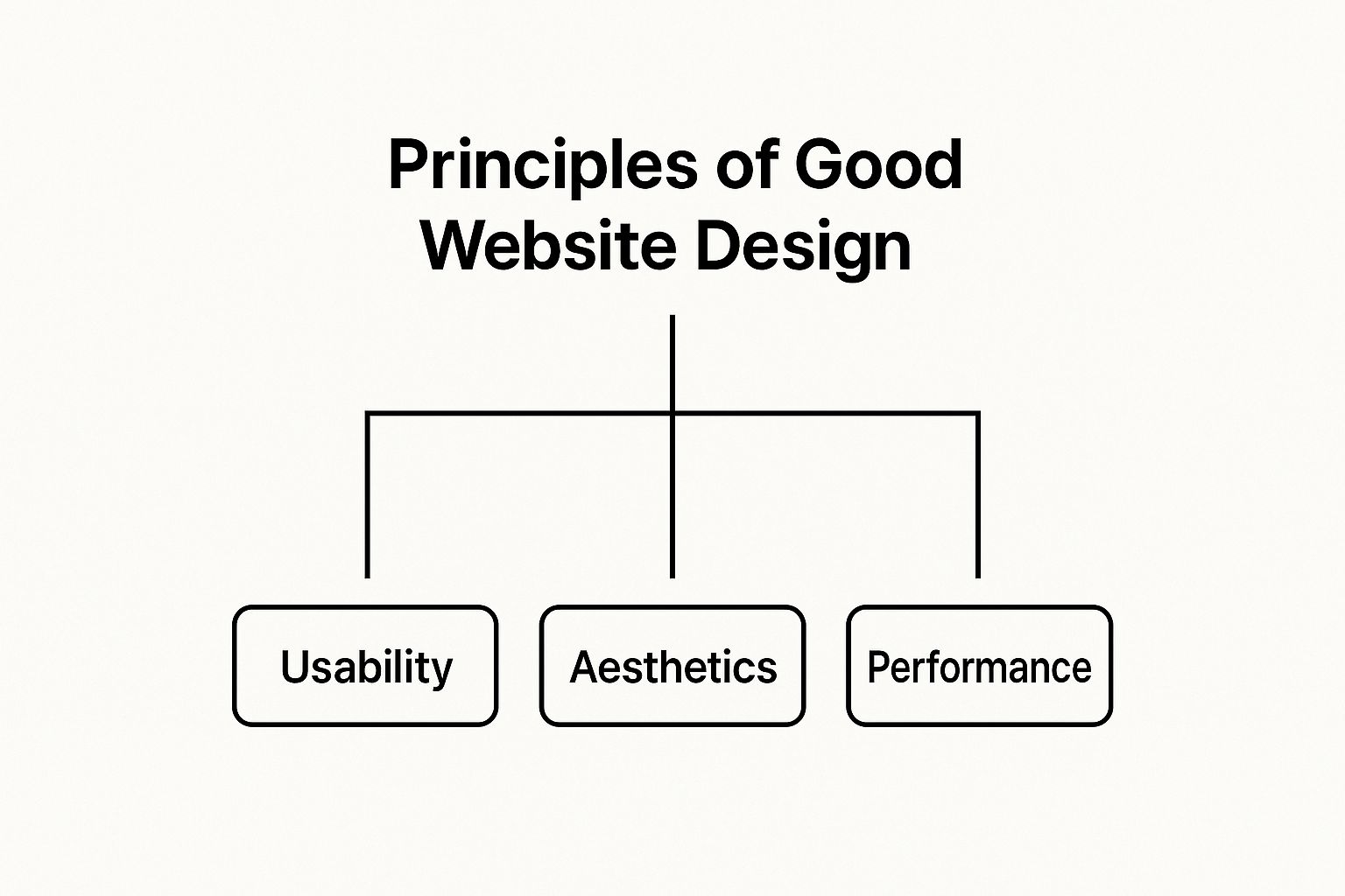
As you can see, a successful website finds the sweet spot between usability, visual appeal, and performance. Each element plays a crucial role in shaping the visitor's journey. For a fantastic real-world example of a site that nails its first impression, take a look at the makerbox homepage.
Throughout this guide, we’ll dive deep into these foundational ideas. To give you a quick preview of what’s to come, the table below summarises the core principles we'll be covering and why they matter for your business.
Core Principles Of Good Website Design At A Glance
| Principle | Core Focus | Key Business Impact |
|---|---|---|
| Usability | How easy and intuitive the site is to use and navigate. | Increases satisfaction, conversions, and reduces bounce rates. |
| Responsiveness | Ensuring a flawless experience on any device, from desktops to mobiles. | Captures mobile traffic and improves SEO rankings. |
| Accessibility | Making the site usable for people with disabilities. | Broadens your audience and demonstrates social responsibility. |
| Visual Hierarchy | Guiding the user's eye to the most important elements first. | Improves scannability and focuses attention on key actions. |
Think of this as your roadmap. By understanding and implementing these principles, you'll be well on your way to creating a website that not only looks great but works beautifully, too.
2. Building an Intuitive User Journey
Of all the principles that underpin great website design, usability is arguably the most critical. At its heart, usability is the art of making your website feel completely effortless and even enjoyable to use.
Think of it like walking into a well-organised supermarket. The aisles are clearly marked, you can find exactly what you're looking for without a fuss, and the checkout is quick and painless. That's what great usability feels like. When a site just works, visitors don't have to think; they can simply do.
On the flip side, a poor user journey is like rummaging through a cluttered pantry for one specific spice. If your visitors can't find what they need in a matter of seconds, they'll simply give up and head over to one of your competitors.
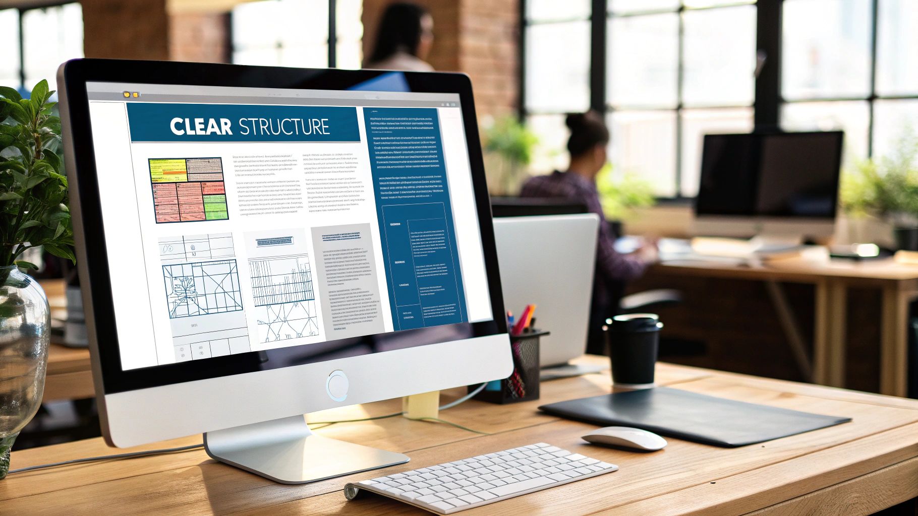
Mapping Out a Logical Information Architecture
Before you can even think about menus and buttons, you need to get your content in order. This is where Information Architecture (IA) comes into play. IA is essentially the practice of organising and labelling your website's content so that people can easily find what they're looking for and achieve their goals.
Imagine you're building a house. You wouldn't start putting in the windows before you've laid the foundation and put up the walls. In the same way, IA is the blueprint for your website. It sets out the hierarchy and defines the relationships between every page and piece of content.
A solid IA ensures your site's structure makes sense to your visitors, not just to your internal team. This simple step prevents people from getting lost in a maze of confusing categories and dead ends, creating a clear path from the moment they land on your site to the moment they convert.
Creating Clear and Predictable Navigation
With your blueprint sorted, you can now build the navigation – the signposts that guide people through your website. Clear navigation is absolutely vital for good usability. It needs to be consistent, predictable, and immediately understandable.
A user should never have to wonder where they are on your site, how they got there, or where to go next. Good navigation provides a constant sense of orientation.
To get this right, the most effective websites use a mix of navigation tools. A primary navigation bar at the top of the page usually shows the main sections, while a "breadcrumb" trail shows the user's current location within the site. For more complex sites, particularly in retail, you can find some fantastic eCommerce website design tips that focus on creating intuitive product categories and filtering systems to really smooth out the user journey.
Designing a User-Friendly Interface
The User Interface (UI) is what people actually see and interact with—the buttons, menus, and forms on the screen. A well-designed UI doesn't try to reinvent the wheel; it follows established conventions that people already understand, making it instantly familiar. For example, we all expect a logo in the top-left corner to take us to the homepage, and a shopping cart icon to be in the top-right.
Straying from these norms without a very good reason just causes confusion and slows people down. The aim is an interface that requires almost no learning curve. Here are a few practical tips for a more intuitive UI:
- Make buttons look like buttons: Use visual cues like shadows, borders, or colour changes on hover to signal that something is interactive.
- Ensure clickable areas are big enough: This is crucial for mobile users tapping with their thumbs. Nothing is more frustrating than a button that's too small to press.
- Provide clear feedback: When a user does something, like submitting a form, give them instant confirmation that it worked. A simple "Thank you!" message makes a world of difference.
By focusing on these core elements—a logical structure, clear signposting, and a predictable interface—you build a user journey that feels natural and supportive. This isn't just about making people happy; it's about guiding them smoothly towards your business goals.
Guiding the User with Visual Hierarchy
Think about the last time you glanced at a newspaper's front page. Your eyes didn't just wander aimlessly; they followed a path. You were immediately drawn to the massive headline, then to the smaller subheadings, and finally to the images and body text. This isn't an accident. It's a carefully crafted design choice called visual hierarchy.
Visual hierarchy is one of the most powerful principles in a designer's toolkit. It’s the art of arranging elements on a page to show their order of importance, creating a clear journey for the user’s eye. Without it, a webpage becomes a chaotic mess where everything screams for attention at once, leaving visitors overwhelmed and unsure where to look.
A strong visual hierarchy turns that chaos into clarity. It instinctively tells visitors what to look at first, second, and third, making your content easy to scan and digest. This guided experience is essential for keeping people engaged and steering them towards your most important calls-to-action.
Harnessing the Core Elements of Hierarchy
Creating this clear visual flow isn't magic; it comes down to strategically using a few key design elements. By adjusting these, you can send powerful signals to the user about which information is most critical and which is supplementary.
These elements work together to build a layout that is both functional and beautiful:
- Size and Scale: This is the most direct way to show importance. Larger elements naturally grab more attention. Your main message or call-to-action should almost always be one of the biggest things on the page.
- Colour and Contrast: Bright, bold colours really stand out against more muted or neutral backgrounds. High contrast is a fantastic tool for making key elements, like a "Buy Now" button, pop off the screen.
- Spacing and Proximity: The amount of white space (or negative space) around an element can make it stand out. At the same time, grouping related items close together, like a product image and its description, creates a logical connection that organises the information for the user.
Mastering these techniques will transform a flat, uninspiring page into a dynamic layout that actively guides user behaviour. You can see more about how these components work together by exploring some of the essential elements explained in what makes a good website design.
A lack of dominance among a group of equally-weighted elements forces competition among them. Readers must then discover their own entry point, which is a chore.
In other words, when you don't create a clear hierarchy, you make your visitors do all the hard work. A truly successful design removes this friction, making the experience feel effortless and intuitive.
Designing for Natural Reading Patterns
Over the years, eye-tracking studies have shown us that people tend to scan web pages in predictable patterns. If you understand these ingrained behaviours, you can design layouts that feel completely natural to follow. The two most common patterns are the F-Pattern and the Z-Pattern.
The F-Pattern
This is the most common scanning pattern for text-heavy pages, like blog posts or search results. A user’s eye moves in a shape that looks a lot like the letter 'F':
- Top Bar: They begin by reading horizontally across the top of the content.
- Lower Bar: Next, they move down the page a bit and read across again, though usually not as far as the first time.
- Vertical Stem: Finally, they scan down the left-hand side of the page, looking for keywords or interesting points in the first few words of paragraphs or bullet points.
The Z-Pattern
This pattern is more common on pages that are less dense with text and have more visual elements, like a typical landing page. The user's gaze follows the shape of the letter 'Z':
- Top Bar: First, they scan from the top-left to the top-right.
- Diagonal: Their eyes then shoot down and across to the left side of the page.
- Bottom Bar: They finish by scanning across the bottom, from left to right again.
By simply aligning your most important elements along these natural reading paths, you dramatically increase the chances that your message will be seen and understood. This simple act of alignment is a cornerstone of effective, user-focused design.
2. Making Your Website Work Perfectly on Any Device

Have you ever tried to pour water from a wide jug into a narrow-necked bottle? It just works. The water adapts, taking the shape of whatever container it's in. This is exactly how we should think about responsive design, one of the most fundamental principles for any modern website.
A responsive website behaves just like that water; it fluidly adjusts its layout to fit any screen, offering a perfect viewing experience every time. Whether someone's browsing on a huge desktop monitor, a tablet, or the phone in their pocket, the content should resize and rearrange itself without a hitch.
This isn’t just a fancy extra. It's an absolute must-have. A website that's clunky and hard to use on a mobile is the digital equivalent of a shop with a door that's too small for customers to get through. You’re simply turning people away.
The move to mobile isn't a passing trend—it's the reality of how we browse the internet now. For any UK business, the numbers speak for themselves. The data from various web design statistics paints a very clear picture of just how critical this is.
Impact of Mobile Performance on UK Businesses
The data tells a stark story: a poor mobile experience doesn't just annoy users, it directly costs UK businesses a significant amount of money. Here’s a quick look at why mobile speed and responsiveness are so critical in today's market.
| Statistic | Business Implication |
|---|---|
| Over 84% of UK users prefer mobile-friendly sites. | You're ignoring the vast majority of your potential audience if your site isn't optimised for mobile. |
| 39% of users abandon a site if images load slowly. | Slow performance directly translates to lost visitors and potential customers. |
| Slow mobile performance costs UK retailers an estimated £2.3 billion annually. | This isn't just about bounce rates; it's a massive, quantifiable financial drain on the economy. |
The takeaway is simple: a fast, responsive mobile site isn't an expense; it's an investment that prevents you from losing customers and revenue every single day.
How Does It Actually Work?
So, what's the magic behind this digital water? You don’t need to be a developer to get the gist. Responsiveness boils down to a couple of clever techniques that work in tandem to create that seamless, adaptive feel.
-
Fluid Grids: Think of your website's layout like a flexible grid. Instead of using rigid, fixed measurements (like pixels), responsive design uses percentages. This means columns and other page elements don't have a fixed width; their size is relative to the screen. As the screen gets smaller, the grid and everything inside it shrinks proportionally.
-
Flexible Images: In the same way, images and videos are designed to scale within their containers. This simple trick prevents a huge image from "breaking" the layout on a small screen by spilling over the sides. It ensures all your visuals stay neat, tidy, and perfectly proportioned, no matter the device.
These two elements are what allow a website to intelligently reconfigure itself. For example, a page with three columns of content on a desktop might smartly stack into a single, easy-to-read column on a mobile phone. It’s all about making the content easy to consume.
Why This Is So Important for Your Business
A great mobile experience is about so much more than just looking good on a phone. It has a direct, measurable impact on your sales, your brand reputation, and even where you show up in Google searches.
A website that isn’t mobile-friendly is actively turning away customers. In today's market, that’s not a risk any business can afford to take.
When you invest in responsive design, you're really investing in your business's future. You’re showing your audience that you respect their time and value their experience, however they choose to find you.
Here’s a quick rundown of the tangible benefits:
- Better SEO Rankings: Google’s "mobile-first" approach means it primarily uses the mobile version of your website for ranking. A responsive site is one of the biggest ticks in the box for strong search performance.
- A Happier Audience: When a site is a breeze to use on a phone, people stick around longer. This builds trust, reduces frustration, and encourages them to come back.
- More Sales and Leads: If customers can easily find what they need and complete a purchase or fill out a form on their mobile, your conversion rates will naturally climb.
- Ready for the Future: New devices with different screen sizes are coming out all the time. A responsive design is built to be flexible, meaning your site will work on tomorrow's gadgets without needing another complete rebuild.
Designing for Everyone with Web Accessibility
Good website design is about more than just what looks good to the average person. A truly great design works for everyone, regardless of their abilities. This simple idea is the heart of web accessibility—an approach that’s not just an ethical duty but also a very smart business move.
Think of it like a modern public building. Architects don't just tack on a ramp as an afterthought; they design buildings with ramps, automatic doors, and lifts from the very beginning. And who benefits? It’s not just people who use wheelchairs. It's parents pushing prams, delivery drivers with trolleys, and even someone on crutches with a temporary injury. Accessibility simply makes the space better for all.
Your website is your digital building. When you intentionally design for people with disabilities, you’re not just catering to a niche. You're actually creating a more solid, more user-friendly experience for your entire audience.
Putting Accessibility into Practice
Accessibility might sound a bit technical or complicated, but getting started is more straightforward than you might think. The core practices have a massive impact and are really about improving the experience for a wider range of people, including those with visual, auditory, motor, or cognitive impairments.
Here are a few practical steps that make a huge difference:
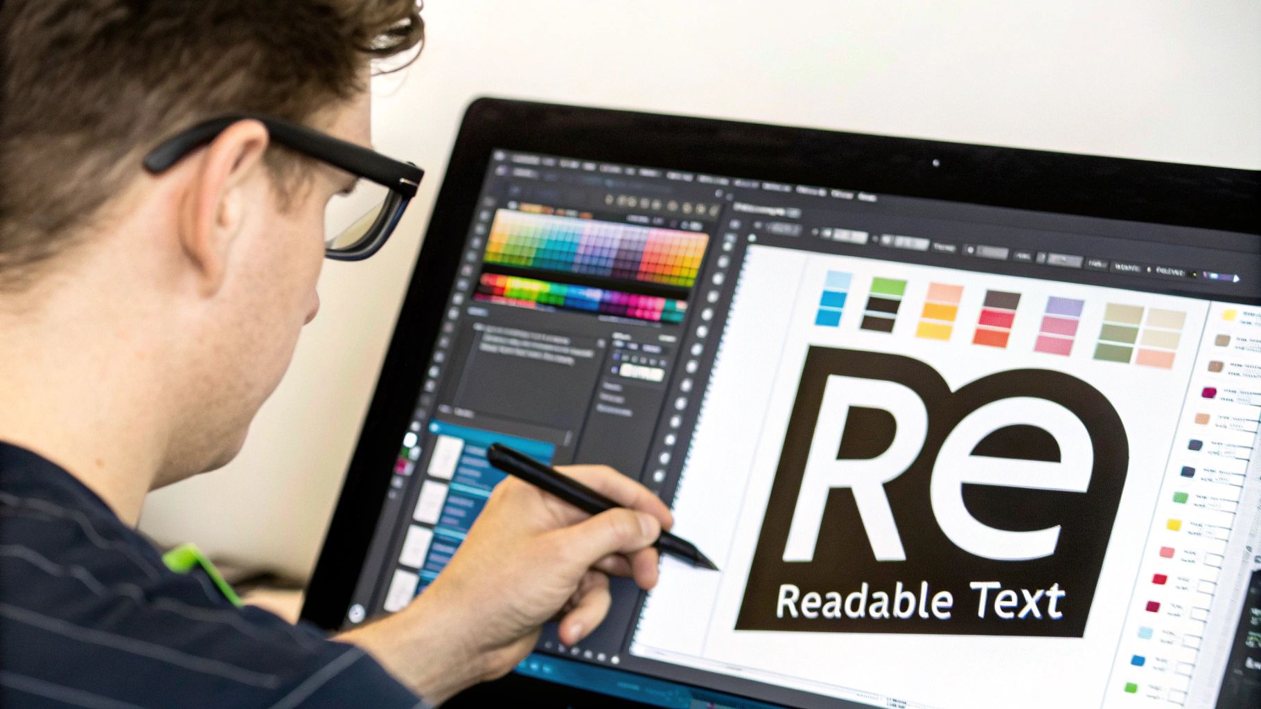
- Provide Descriptive Alt Text for Images: Alternative (alt) text is a short, written description of an image. Screen readers use this to tell visually impaired users what's in a picture, so they get the full context instead of just hearing "image" and missing vital information.
- Check for High Colour Contrast: Text needs to stand out clearly from its background. Tools that check the contrast between your font and background colours are a lifesaver for users with low vision or colour blindness, helping them read your content without straining their eyes.
- Allow Full Keyboard Navigation: Not everyone can use a mouse. A properly accessible site allows people to navigate everything—links, menus, forms, buttons—using only their keyboard (typically the tab, enter, and arrow keys).
The Ripple Effect of Inclusive Design
When you start thinking inclusively, you'll find the benefits extend far beyond the original audience you were trying to help. For example, clear captions on your videos are essential for users who are deaf or hard of hearing. But they also help someone watching in a noisy office, on public transport, or who just prefers to read along.
"The power of the Web is in its universality. Access by everyone regardless of disability is an essential aspect." – Tim Berners-Lee, Inventor of the World Wide Web
This idea of universality is what it's all about. An accessible site is often a faster-loading site, which is great for people on slow internet connections. It's also usually structured more logically, which improves its SEO performance and makes it easier for everyone to find what they're looking for.
Ultimately, making accessibility a priority says something powerful about your brand. It shows you’re thoughtful, inclusive, and dedicated to giving every single visitor a quality experience. This doesn't just expand your potential customer base; it builds profound trust and cements your reputation. It’s a win for your users and a clear win for your business.
Why Investing in Good Design Is Smart Business
We’ve journeyed through the core principles of great website design, from crafting intuitive user journeys to making your site accessible to everyone. Now, let’s bring it all home and tackle the one question every business owner asks: what’s the real return on this investment?
Let me be clear: excellent web design isn't just another expense on your balance sheet. It’s a powerful engine for growth.
Think of your website as your most dedicated salesperson, working around the clock to build trust and close deals. When all the pieces we've discussed—usability, visual hierarchy, responsiveness, and accessibility—click into place, they create an experience that feels effortless for the user. This polish directly translates into tangible business results, making your brand look more professional and trustworthy than a competitor with a clunky, dated site.
From Principles to Profit
The line connecting design principles to your bottom line is surprisingly direct. A truly usable and accessible site instantly widens your potential audience, while a responsive design means you're ready for the massive, and still growing, mobile market. More reach naturally means more chances to connect and sell.
What’s more, a strong visual hierarchy isn’t just about looking good; it's about gently guiding visitors towards your most important goals. Whether that’s clicking "Buy Now," filling out a contact form, or signing up for your newsletter, each step is smoother. These actions are what drive higher conversion rates and, ultimately, more revenue.
When you apply these principles, you're not just decorating a webpage; you're building a digital asset that actively helps you hit your targets. If you're planning a refresh, using a detailed website redesign checklist is a fantastic way to ensure none of these crucial elements are missed.
Investing in a high-quality, user-centric website is one of the most significant competitive advantages a modern business can have. It signals to the market that you value your customers' experience and are serious about your digital presence.
The Lasting Value of Professional Design
Even as technology changes, the demand for skilled web designers remains incredibly strong. The UK's web design services sector is valued at around £640.6 million, and despite economic ups and downs, the need for professional designers is projected to grow by 8% between 2023 and 2033. That’s double the growth rate of many other professions.
This isn’t a fluke. It's driven by the simple fact that businesses realise the immense value of a professionally crafted user experience. You can find more data on the UK web design industry's economic landscape on invernessdesignstudio.com.
Ultimately, sticking to the principles of good web design is about future-proofing your business. It ensures your online presence is robust, inclusive, and brilliant at turning casual visitors into loyal customers. This isn’t just about making things pretty; it’s a strategic investment in your long-term success.
Your Website Design Questions Answered
Even when you've got a handle on the theory, putting it into practice always throws up a few questions. Let's tackle some of the common queries that pop up when business owners start thinking about their websites.
How Often Should I Redesign My Website?
The old-school approach of a huge, disruptive website overhaul every few years is starting to feel a bit dated. A more modern, and frankly more sensible, way to think about it is through iterative improvements.
It’s less like knocking your house down and rebuilding it, and more like redecorating one room at a time. This way is far less disruptive for your visitors and allows you to constantly adapt based on real user feedback and your own shifting business goals.
A full, top-to-bottom redesign really only makes sense if:
- You’ve gone through a complete rebrand.
- The technology your site is built on is genuinely obsolete and holding you back.
- Your entire business model has pivoted.
Otherwise, your best bet is to focus on small, continuous enhancements. One month you might refine your visual hierarchy, the next you could work on improving the mobile navigation. It’s all about graceful evolution.
Can I Apply These Principles to My Existing Site?
Absolutely! You don’t need to tear everything down and start again to make a real difference. The best place to begin is with a simple audit of your current site, looking at it through the lens of the principles we've covered: usability, responsiveness, and visual clarity.
Your existing website is a goldmine of data. Instead of throwing it away, use analytics and user feedback to identify the biggest pain points and opportunities for quick wins.
Start with the low-hanging fruit—the changes that will give you the biggest impact for the least effort. Something as simple as improving the colour contrast on your call-to-action buttons or decluttering your main navigation menu can boost engagement almost immediately. Applying these principles bit by bit makes the whole process manageable and much more effective.
What Is the Most Important Principle for a Small Business?
If you’re a small business, and resources or budget are a primary concern, then zero in on usability and mobile responsiveness. While a beautiful design is great, a website that’s a breeze to use and works flawlessly on a phone will always deliver a better return.
Think about it: a smooth user journey means people can find what they need and complete a purchase without getting frustrated, which has a direct impact on your bottom line. And with most web traffic now coming from mobile, a perfect mobile experience isn’t a nice-to-have; it's absolutely essential for reaching your customers. Focus on getting these two right, and you’ll be on the path to success.
Ready to apply these principles and create a website that drives growth for your business? The expert team at Ibertech Solutions Limited specialises in bespoke web design, SEO, and digital marketing for small and medium-sized businesses. Discover how we can enhance your online presence today.