
Table of Contents
- What is a Mobile Responsive Website?
- How Mobile-First Indexing UK Changes Your SEO Strategy
- The Business Impact: Conversion Rates and Customer Retention
- Mobile Responsive Website Examples That Drive Results
- How to Test If My Website Is Mobile Friendly
- Core Web Vitals and Mobile Performance: What You Need to Know
- Why Accessibility Matters on Mobile Devices
- Getting Your Website Mobile Ready
Last Updated: August 6, 2026

What is a Mobile Responsive Website?
A mobile responsive website is a website designed to adapt automatically to any screen size, whether viewed on a desktop, tablet, or smartphone. The layout, images, and content reflow dynamically based on the device being used, ensuring that users get an optimal viewing experience regardless of how they access your site.
Responsive design achieves this through flexible grids, adaptable images, and CSS media queries, technical tools that detect screen width and adjust the design accordingly. Rather than maintaining separate websites for desktop and mobile (an outdated approach), a single responsive site serves all devices intelligently.

Why does this matter for your business? Mobile traffic now dominates. Most visitors arrive on phones, and if your site isn’t responsive, they’ll bounce immediately. Google also prioritises responsive sites in search rankings, making this a critical factor for visibility and organic traffic.
How Mobile-First Indexing UK Changes Your SEO Strategy
Google’s mobile-first indexing means the search engine now crawls and ranks websites based on their mobile version first, not the desktop version. For UK businesses, this is not a future consideration, it’s the current reality of how your site gets discovered.
What this means in practice: if your website isn’t mobile-friendly, Google sees an inferior version of your content. Poor mobile experience directly impacts your rankings, which directly impacts how many potential customers find you through search.
The shift happened because mobile traffic exceeded desktop traffic years ago. Google simply aligned its indexing with user behaviour. A business in Diss, Norfolk, competing for local searches now faces a landscape where mobile responsiveness isn’t optional, it’s a ranking factor.
To adapt your SEO strategy:
- Ensure your primary content is accessible on mobile without truncation or hidden elements
- Test page load speed on mobile specifically (Google’s Core Web Vitals measure mobile performance heavily)
- Check that internal links work properly on small screens
- Verify that images scale correctly and don’t break layout on narrow viewports
- Confirm that navigation is thumb-friendly, not cluttered
If you’re unsure where your site stands, a Free SEO Audit can identify mobile-specific issues affecting your rankings. The businesses winning local search visibility in Norfolk and Suffolk right now are those who took mobile-first seriously years ago. If you haven’t, you’re competing with one hand tied behind your back.
The Business Impact: Conversion Rates and Customer Retention
A non-responsive website doesn’t just lose search visibility, it loses customers. When someone lands on your site via mobile and encounters a broken layout, tiny text, or buttons they can’t tap, they leave. Most don’t come back.

Conversion rates on mobile-responsive sites are measurably higher than on sites that aren’t optimised. Users can read your content, navigate easily, and complete actions (filling forms, making purchases, booking appointments) without frustration. Every friction point you remove converts more visitors into leads.
For e-commerce businesses especially, mobile responsiveness directly affects revenue. A customer browsing your products on their phone should be able to view images clearly, read descriptions, and check out without resizing or scrolling excessively. If they can’t, they’ll shop elsewhere.
Customer retention improves too. Visitors who have a good mobile experience are more likely to return. They’re also more likely to recommend your business or share your content. A poor mobile experience creates the opposite, frustrated users who tell others to avoid you.
Local businesses in Norfolk and Suffolk lose significant revenue by neglecting mobile optimisation. Your competitors who’ve invested in responsive design are capturing the customers you’re losing.
Mobile Responsive Website Examples That Drive Results
Understanding responsive design in theory is useful; seeing it in action is more convincing.
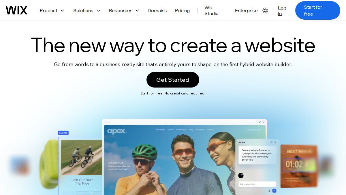
Wix demonstrates responsive design through its extensive template library, all of which are mobile-optimised by default. Users can design on desktop and the site automatically adjusts for mobile, though manual fine-tuning is sometimes needed.
Squarespace takes a different approach with templates that are consistently responsive across all devices. The platform prioritises visual consistency, ensuring that a beautiful desktop design translates seamlessly to mobile without requiring separate adjustments.
WordPress with responsive themes like Astra or Divi offers flexibility for businesses needing customisation. These themes use modern responsive frameworks, allowing developers and business owners to build highly tailored sites that work on all devices.
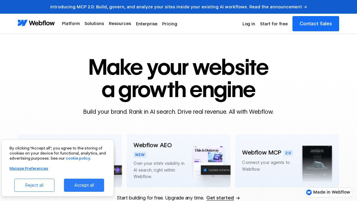
Webflow gives designers granular control over responsive behaviour through visual tools. Rather than relying on a theme, designers specify exactly how elements should behave at different breakpoints, creating highly customised responsive experiences.
What these examples share: they all prioritise mobile experience as a first-class concern, not an afterthought. The design process either starts with mobile or ensures mobile works equally well as desktop.
For a bespoke business website in Diss or elsewhere in Norfolk, the principle remains the same, mobile responsiveness must be built in from the start, not added later.
How to Test If My Website Is Mobile Friendly
You don’t need to guess whether your site is mobile-friendly. Several free tools provide immediate feedback.
Google Mobile-Friendly Test is the most authoritative option. Enter your website URL, and Google analyses whether your site meets mobile usability standards. The tool shows you a screenshot of how your page appears on a mobile device and flags any issues it detects. Since Google uses this same analysis for search rankings, this test directly reflects how your site performs in search results.

Ahrefs Site Audit goes deeper, crawling your entire website to identify technical SEO issues including mobile usability problems. It checks viewport configuration, content sizing, and other factors that affect mobile experience. This is useful if you want a comprehensive picture of mobile-related issues across your whole site.
BrowserStack allows you to test your website on real mobile devices and browsers. Rather than simulating mobile, you see exactly how your site looks on actual phones and tablets. This is the most thorough approach, though it requires a subscription.
For most businesses, Google’s free test is the logical starting point. If it shows issues, you’ve identified problems that are actively harming your search rankings. If it passes, your site meets Google’s mobile standards, though there’s always room for further optimisation.
Many businesses in Norfolk and Suffolk discover through these tools that their existing website has mobile issues they didn’t know about. The test takes seconds and often reveals the reason for poor lead generation or traffic.
Core Web Vitals and Mobile Performance: What You Need to Know
Core Web Vitals are three specific metrics Google uses to measure page experience, and they’re weighted heavily in mobile rankings. Understanding them helps you prioritise the right optimisations.
Largest Contentful Paint (LCP) measures how quickly the main content of your page loads and becomes visible. On mobile, users expect this to happen within 2.5 seconds. Slow LCP frustrates visitors and signals poor performance to Google.
Cumulative Layout Shift (CLS) measures visual stability, how much the page layout shifts around as it loads. If text, buttons, or images move unexpectedly, users click the wrong thing or get annoyed. A stable layout is essential for mobile, where screen space is limited and accidental taps are common.
First Input Delay (FID) measures responsiveness, how quickly your page responds when a user interacts with it. On mobile, this matters more than desktop because users expect instant feedback. Slow response times feel broken.
These metrics directly affect your search rankings on mobile devices. A site with poor Core Web Vitals will rank below competitors with better vitals, all else being equal.
Improving them requires technical work: optimising images, reducing JavaScript, using caching, and ensuring your hosting can handle traffic. For many businesses, working with a professional web development partner is the most efficient path.
Why Accessibility Matters on Mobile Devices
Accessibility often gets overlooked in mobile design, but it’s both a legal and business imperative. The Web Content Accessibility Guidelines (WCAG) set standards for making websites usable by everyone, including people with disabilities.
On mobile specifically, accessibility becomes even more critical. A person with low vision using a larger font size needs your responsive design to reflow gracefully at that size. Someone using a screen reader needs your mobile interface to work with voice navigation. Touch targets must be large enough for people with motor control difficulties.
Beyond compliance, accessible design is just good design. Larger text is easier for everyone to read, not just people with vision impairments. Clear navigation benefits all users. Proper colour contrast helps in bright sunlight, where many mobile users are.
Many businesses worry that accessibility adds complexity or cost. In reality, building accessibility in from the start is simpler and cheaper than retrofitting it later. A responsive design that’s built properly is usually accessible by default.
Testing for accessibility is straightforward. Tools like WAVE and Axe DevTools scan your site for common issues. Manual testing, actually trying to navigate your site with a keyboard only, or with a screen reader, reveals problems automated tools might miss.
For UK businesses, the Equality Act 2010 requires that websites be accessible. Failure to meet accessibility standards can result in legal action. Beyond legal risk, inaccessible sites simply exclude customers, a poor business decision.
Getting Your Website Mobile Ready
If your current website isn’t mobile-responsive, you have two main paths: rebuild or migrate.
Rebuilding means creating a new responsive website from scratch. This is the cleaner approach if your current site is outdated, uses old technology, or has structural problems that make responsive retrofitting difficult. A rebuild gives you modern tools, better performance, and a solid foundation for years to come.
Migrating to a responsive platform means moving your content to a website builder or CMS that handles responsiveness automatically. Platforms like Wix, Squarespace, and WordPress (with responsive themes) do most of the heavy lifting. This approach is faster and cheaper than a full rebuild, though you may lose some customisation.
For many small and medium-sized businesses in Norfolk and Suffolk, a bespoke rebuild is a strong investment. A custom-built responsive site tailored to your specific business needs can perform well and give you a competitive advantage.
The process typically involves:
- Auditing your current site to identify what’s working and what needs to change
- Planning the new site structure and user experience
- Designing mobile-first (starting with the mobile layout, then expanding to larger screens)
- Building with responsive techniques from the ground up
- Testing thoroughly on real devices and browsers
- Migrating content and setting up redirects to preserve SEO value
- Monitoring performance and making adjustments post-launch
The timeline varies depending on complexity, but most projects take 6-12 weeks from start to launch.
Post-launch support matters too. A responsive website isn’t a set-it-and-forget-it asset. You’ll need ongoing monitoring, security updates, and performance optimisation. Businesses that neglect this often see their sites degrade over time as browsers update, traffic patterns change, and technology evolves.
A mobile responsive website isn’t a luxury feature anymore, it’s a requirement for any business serious about growth. It affects your search rankings, your conversion rates, your customer retention, and your ability to compete. If your website isn’t mobile-responsive, you’re losing customers and revenue to competitors who’ve already made the investment.
At Ibertech Solutions in Diss, Norfolk, we specialise in Web Design that puts mobile responsiveness at the heart of everything we build. Our team ensures your site meets Core Web Vitals standards, performs beautifully on all devices, and supports your business goals. Whether you need a complete rebuild or optimisation of an existing site, we provide the expertise and ongoing support to keep your digital presence working for you. Get in touch today to discuss how a mobile responsive website can transform your business.
Frequently Asked Questions
Why does every business need a mobile-friendly website?
Over 60% of web traffic now comes from mobile devices. If your website isn't mobile responsive, you're losing customers at the moment they search for you. Mobile-friendly sites also rank higher in Google's search results, meaning more visibility for your business. Without mobile responsiveness, you're essentially turning away potential customers before they even see what you offer.
How does mobile responsiveness affect SEO in the UK?
Google uses mobile-first indexing, which means it crawls and ranks your website based on its mobile version first. If your site isn't mobile responsive, Google sees a poor user experience and ranks you lower. This directly impacts your visibility in search results. A responsive design that works seamlessly across devices signals to Google that you've prioritised user experience, which boosts your rankings and organic traffic.
What's the difference between a mobile-friendly website and a responsive one?
A mobile-friendly site is simply accessible on mobile devices, but a responsive website automatically adjusts its layout, images, and content to fit any screen size perfectly. Responsive design uses flexible grids and media queries to adapt to different devices, providing a consistent user experience whether someone visits on a phone, tablet, or desktop. This approach is more future-proof and reduces bounce rates significantly.
Can I test my website's mobile responsiveness for free?
Yes. Google's Mobile-Friendly Test is a free tool that shows you how your site appears on mobile devices and flags any usability issues. Simply enter your website URL at search.google.com/test/mobile-friendly. For more detailed technical analysis, tools like Ahrefs Site Audit offer free options that check mobile performance alongside other SEO factors. These free tests give you a solid starting point to understand where improvements are needed.