
Ready for a Digital Makeover? Here’s Where to Start
Embarking on a website redesign is a significant undertaking, one that can dramatically reshape your online presence, improve user engagement, and drive business growth. However, without a structured plan, even the most well-intentioned projects can veer off course, leading to budget overruns, missed deadlines, and a final product that fails to meet expectations. This is where a detailed website redesign checklist becomes your most valuable asset. It transforms a complex, multi-faceted process into a manageable, step-by-step journey.
This guide isn’t just a list; it’s a comprehensive roadmap, meticulously organised to navigate you through every critical phase. We will cover everything from initial strategic planning and in-depth audits to technical SEO, rigorous testing, and post-launch analysis. For businesses in East Anglia and beyond, a well-executed redesign can mean the difference between blending in and standing out. If your project involves a deeper brand evolution, aligning your efforts with a thorough rebranding process checklist can provide a structured approach to your transformation, ensuring consistency across all touchpoints.
By following the crucial steps outlined in this article, you will not only avoid common pitfalls but also build a foundation for a high-performing, user-centric, and future-proof website that truly delivers results. We’ll delve into actionable insights, practical examples, and expert tips to ensure your redesign is a resounding success, whether you’re a local retailer launching a new eCommerce platform or a growing company refining its digital strategy. Let’s begin building a website that works as hard as you do.
1. Define Goals and Objectives
Embarking on a website redesign without a clear destination is like setting sail without a map. Before a single wireframe is sketched or a line of code is written, the most critical step in any successful website redesign checklist is to define clear, measurable, and agreed-upon goals. This foundational stage dictates the direction of the entire project, ensuring that every decision, from layout choices to functionality, is purposeful and aligned with your business’s core needs.
Why Start with Goals?
Defining your objectives transforms the redesign from a subjective cosmetic update into a strategic business initiative. Are you aiming to increase online sales by 20%? Reduce bounce rates on key service pages by 30%? Or perhaps modernise your brand image to attract a new demographic? Clear goals provide a framework for success and prevent “scope creep”, where new features are added without strategic purpose. For instance, Slack’s redesign focused on simplifying its user onboarding process to improve adoption rates, a goal that directly influenced the final product’s structure and content.
A Practical Goal-Setting Framework
To ensure your objectives are robust, they must be specific and quantifiable. Vague aspirations like “improve user experience” are not actionable. Instead, use a structured approach to translate broad ambitions into tangible targets. This process involves identifying what you want to achieve, how you will measure success, and the timeline for completion. Involving all key stakeholders, from marketing and sales to customer support, is vital to gain a holistic view of what the new website needs to accomplish.
The process flow diagram below illustrates a simple yet powerful framework for establishing effective project goals, moving from high-level objectives to concrete metrics and timelines.
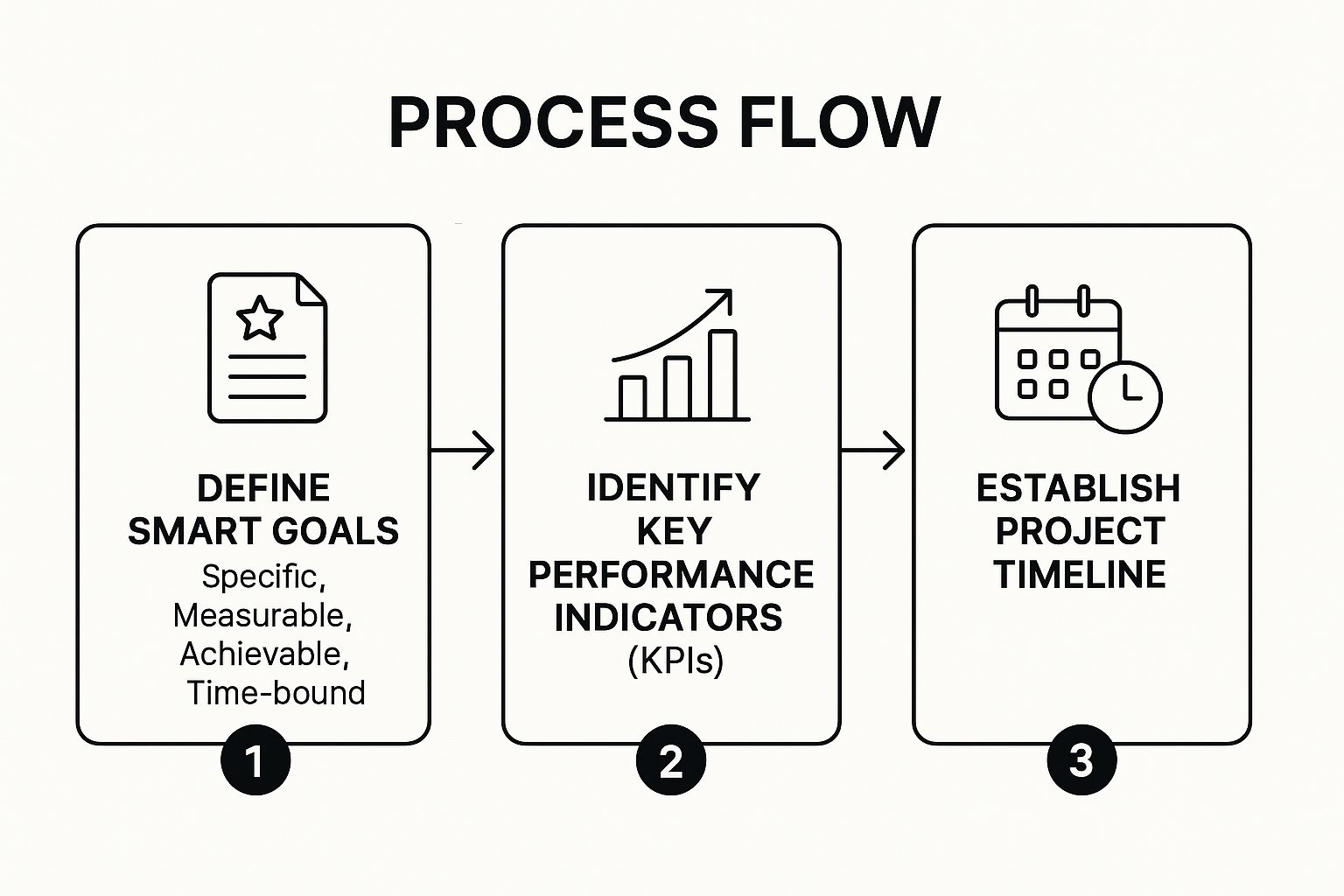
Following this sequence ensures that your goals are not only well-defined (SMART) but are also directly linked to trackable performance indicators (KPIs) and a realistic schedule. This structured approach provides the clarity and direction needed to guide your entire redesign project from concept to launch.
2. Conduct Comprehensive Website Audit
Before you can build a better website, you must deeply understand your current one. A comprehensive audit is the diagnostic phase of your website redesign checklist, providing an objective analysis of your site’s strengths, weaknesses, opportunities, and threats. This crucial step involves a meticulous examination of your content, technical performance, SEO health, and user experience, ensuring your redesign efforts are data-driven and focused on areas that will deliver the most significant impact.
Why Start with an Audit?
Skipping a thorough audit is like a doctor prescribing treatment without a diagnosis; you might fix a symptom while ignoring the root cause. A website audit provides the empirical evidence needed to justify design and structural changes, moving decisions away from subjective opinion and towards strategic improvements. For example, during their pre-redesign audit, Mailchimp identified critical performance bottlenecks that were negatively affecting user retention. This data-backed insight allowed them to prioritise technical optimisation, directly improving a key business metric. Similarly, Harvard Business Review’s audit revealed that mobile traffic had surpassed desktop by 60%, fundamentally shifting their design focus to a mobile-first approach.
A Practical Auditing Framework
A successful audit deconstructs your website into four key areas: technical SEO, content, user experience, and overall performance. By analysing each component, you can build a complete picture of what to keep, what to improve, and what to discard. This systematic review prevents you from carrying over legacy problems into the new design and helps you preserve valuable assets, such as high-ranking pages and popular content.
The process involves gathering data from multiple sources to create a holistic view. Here are the core pillars of a comprehensive website audit:
- Technical & SEO Analysis: Use tools like Screaming Frog or Ahrefs to crawl your site, identifying issues such as broken links, duplicate content, slow page speed, and improper redirects. Documenting your current site architecture and URL structure is essential for planning 301 redirects to preserve SEO equity.
- Content Inventory: Create a detailed spreadsheet of all your website’s content. List each URL, title, content type, and key performance metrics like page views, bounce rate, and time on page from Google Analytics. This helps you identify high-performing content to keep, underperforming content to improve or remove, and content gaps to fill.
- User Behaviour Analysis: Dive into Google Analytics to understand how users navigate your site. Analyse user flow reports, popular landing pages, and exit pages to pinpoint areas of friction. Heatmaps and session recording tools like Hotjar can provide visual insights into where users click, scroll, and struggle.
- Competitive & Performance Benchmarking: Evaluate your site against key competitors. What do they do well? Where are the opportunities for you to differentiate? Finally, document your current key performance indicators (KPIs) so you have a baseline to measure the new site’s success against.
3. Analyze User Research and Create Personas
If goals are the destination for your redesign, then user research is the compass that guides you there. A website built without a deep understanding of its audience is destined to miss the mark. A crucial step in any comprehensive website redesign checklist is to conduct thorough user research and synthesise that data into detailed personas. This process moves beyond assumptions, grounding your design and content decisions in the real-world needs, behaviours, and pain points of the people you want to reach.

Why Base Design on Personas?
Personas are fictional, yet realistic, representations of your key audience segments. Popularised by pioneers like Alan Cooper, they transform abstract data into relatable human characters. This human-centred approach ensures that your team designs for “Sarah the Project Manager” rather than a vague “user”. For example, Dropbox famously used persona-driven insights to redesign its onboarding process, which resulted in a 40% improvement by directly addressing the specific needs and technical anxieties of their target user groups. Personas keep the project focused on solving actual user problems, leading to higher engagement, better usability, and increased conversions.
A Practical Framework for Persona Creation
Effective personas are built on a foundation of both quantitative and qualitative data. This means combining website analytics, such as traffic sources and user flow, with qualitative insights from surveys, interviews, and feedback sessions. Startups can find this particularly crucial when building their first business website to ensure they connect with their initial customer base. The goal is to create a small set of primary personas that the entire team can rally behind.
To build robust personas, follow these practical steps:
- Combine Data Sources: Blend Google Analytics data on demographics and behaviour with direct feedback from customer interviews or support tickets to get a complete picture.
- Focus on Key Segments: Aim to create 3-5 primary personas that represent the majority of your user base. Creating too many can dilute their impact and make them difficult to use.
- Bring Them to Life: Include a name, a real stock photo, a job title, goals, and frustrations. Adding a direct quote like, “I need to find a reliable supplier quickly without endless forms,” makes the persona’s motivations instantly clear.
- Share and Evangelise: Distribute the finalised personas across all teams, from developers to marketers. They should be a constant reference point during every design review and strategic discussion to ensure user-centricity is maintained throughout the project.
4. Plan Information Architecture and Site Structure
If goals are the destination, then Information Architecture (IA) is the road map that guides your users there. Planning your site structure is a fundamental step in any website redesign checklist, focused on organising and labelling content so users can find what they need efficiently and intuitively. This isn’t just about creating menus; it’s about building a logical hierarchy that supports user journeys and aligns with your business objectives, ensuring a seamless and frustration-free experience.
Why Prioritise Architecture?
A poorly organised website is like a disorganised shop where products are scattered randomly across the aisles. Users will quickly become frustrated and leave. A strong IA, however, improves usability, boosts SEO by making content easier for search engines to crawl, and directly impacts conversions. For instance, when the outdoor retailer REI restructured its navigation based on user behaviour, it saw a 35% increase in visits to key product pages. This demonstrates how a user-centric structure is not a cosmetic choice but a powerful strategic tool that delivers tangible results.
A Practical Framework for Site Structure
Developing a robust IA involves understanding how your audience thinks and structuring your content to match their mental models. This means moving beyond your internal company language and organising information from the user’s perspective. Key activities include user research like card sorting, where participants group topics into categories that make sense to them, and tree testing to validate a proposed navigation structure. Creating a visual sitemap early in the process provides a clear blueprint for designers and developers, preventing confusion and ensuring the final build is logical and scalable.
To build an effective IA, consider these actionable steps:
- Conduct Card Sorting: Ask real users to group your content topics. This reveals their natural thought processes and helps you create intuitive navigation categories.
- Develop Visual Sitemaps: Before wireframing, create a diagram showing the hierarchy of your pages. This blueprint guides the entire design and development process.
- Plan URL Redirects: Map out all old URLs to their new counterparts. This is crucial for preserving your SEO authority and preventing broken links post-launch.
- Test with Tree Testing: Validate your proposed navigation structure by asking users to find specific information within your sitemap. This confirms whether your hierarchy is truly intuitive.
- Consider Mobile Navigation: Design navigation patterns that work seamlessly on both desktop and mobile devices, such as using a “hamburger” menu or a bottom tab bar for smaller screens.
5. Create Wireframes and Prototypes
Moving from abstract goals to a tangible structure is a pivotal moment in any website redesign. This is where wireframes and prototypes come into play, serving as the architectural blueprint for your new digital presence. Before any visual design elements like colours or fonts are chosen, this crucial step in your website redesign checklist focuses entirely on layout, functionality, and user flow, ensuring the site is built on a solid, user-centric foundation.
Why Start with a Blueprint?
Developing a wireframe transforms your project from a list of features into a visual representation of the website’s structure. This low-fidelity, black-and-white schematic allows stakeholders to focus purely on usability and information hierarchy without the distraction of design aesthetics. It’s the stage where you answer critical questions: Where does the main call-to-action go? How will users navigate between key sections? For example, Uber’s app redesign famously involved over 200 wireframe iterations to perfect the user journey, proving that this early-stage planning is vital for complex interfaces.
A Practical Prototyping Workflow
To ensure your structural plans are effective, the process should be iterative, starting simple and adding complexity over time. Begin with basic paper sketches to quickly explore ideas, then transition to digital wireframing tools like Balsamiq or Figma to create a clean, shareable blueprint. The final step is to build an interactive prototype, which links these static wireframes together to simulate the user experience. This allows for early-stage user testing, helping to identify and resolve usability issues long before costly development work begins.
This video from Figma provides an excellent overview of how to turn static designs into interactive prototypes, a critical skill for modern web design.
By following this iterative process, you ensure that the final design is not just visually appealing but is also fundamentally intuitive and aligned with user expectations. This methodical approach, popularised by design leaders like IDEO and Basecamp, prevents costly revisions later by solidifying the website’s core structure and functionality early in the project.
6. Develop Visual Design and Brand Consistency
With a solid structure defined by wireframes, the next crucial step in your website redesign checklist is to breathe life into the blueprint with visual design. This stage is where your brand’s personality, values, and messaging are translated into a tangible visual language. It involves meticulously crafting a cohesive identity through colour schemes, typography, imagery, and interface elements, transforming functional layouts into an engaging and polished user experience that resonates with your target audience.

Why Prioritise a Cohesive Visual Identity?
A consistent visual identity builds trust and reinforces brand recognition. When users encounter predictable design patterns and familiar brand elements across your site, it creates a sense of reliability and professionalism. For instance, Spotify’s design system, ‘Encore’, ensures that whether you are using their mobile app, desktop client, or web player, the experience feels unified and intuitive. This consistency is not merely aesthetic; it directly impacts usability by making navigation and interaction more predictable. In contrast, an inconsistent design can appear disjointed and unprofessional, eroding user confidence and weakening your brand message.
A Practical Framework for Visual Design
Establishing a comprehensive design system or style guide is the most effective way to ensure consistency. This document acts as a single source of truth for your entire team, outlining all visual components from logo usage and colour palettes to button styles and typographic scales. It should be guided by principles like those in Google’s Material Design or Brad Frost’s Atomic Design methodology, which advocate for building designs from small, reusable components. For businesses in the retail space, these visual decisions are paramount, as they directly influence purchasing behaviour. Exploring effective eCommerce website design tips can provide further insight into creating visuals that convert. This structured approach not only speeds up the design process but also ensures that every new page or feature adheres to the established brand guidelines, maintaining a seamless experience as your website evolves.
7. Ensure Mobile Responsiveness and Cross-Browser Compatibility
In an era where over half of all web traffic originates from mobile devices, a website that fails to perform flawlessly on any screen is fundamentally broken. Ensuring your redesigned site is mobile-responsive and cross-browser compatible is a non-negotiable step in any modern website redesign checklist. This process involves implementing a design that fluidly adapts to various screen sizes, from a small smartphone to a large desktop monitor, guaranteeing a seamless and accessible experience for every user, regardless of their device or browser choice.
Why Prioritise a Mobile-First Approach?
A mobile-first strategy, championed by industry pioneers like Luke Wroblewski, dictates that you design for the smallest screen first and then work your way up. This approach forces you to prioritise essential content and functionality, resulting in a cleaner, more focused, and faster-loading experience for all users. Neglecting mobile responsiveness can lead to high bounce rates, frustrated visitors, and a negative perception of your brand. For instance, Starbucks’ mobile-responsive redesign led to a 23% increase in mobile orders, demonstrating the direct commercial impact of a superior mobile experience.
A Practical Framework for Implementation
Achieving true responsiveness goes beyond simply shrinking down a desktop site. It requires a thoughtful approach to layout, navigation, and user interaction. To deliver an optimal experience across all platforms, you must test rigorously and build with flexibility at the core of your design. This ensures that your site not only looks good but is also fully functional and easy to use everywhere.
Here are some actionable tips for effective implementation:
- Utilise Modern CSS: Employ flexible layout tools like CSS Grid and Flexbox. These allow you to create dynamic, adaptable page structures that respond intelligently to different screen sizes without complex code.
- Test on Real Devices: While browser emulators are useful for quick checks, they cannot replicate the nuances of a real device. Comprehensive testing on a variety of actual smartphones and tablets is crucial to identify and fix device-specific bugs.
- Optimise User Interaction: Ensure all interactive elements, like buttons and links, are touch-friendly. A minimum target size of 44×44 pixels helps prevent frustrating mis-taps and improves usability on touchscreens.
- Implement Responsive Images: Use techniques like the
<picture>element or thesrcsetattribute to serve different image sizes based on the user’s screen resolution. This significantly improves page load times on mobile devices with slower connections.
8. Implement SEO Best Practices and Technical Optimisation
Launching a beautifully designed website that nobody can find is a digital disaster. A critical component of any website redesign checklist is the meticulous implementation of technical SEO and best practices. This step ensures that your new site not only retains the search engine authority it has already earned but also builds a stronger foundation for future growth. Neglecting this can lead to a catastrophic drop in organic traffic, rendering your redesign efforts counterproductive.
Why Prioritise Technical SEO?
Technical SEO forms the bedrock of your online visibility. It directly impacts how search engine crawlers discover, understand, and rank your pages. A redesign is the perfect opportunity to audit and rectify underlying technical issues that may have hindered your previous site’s performance. For example, HubSpot famously executed a redesign while retaining 99% of its organic traffic by focusing on a flawless SEO migration strategy. This highlights that technical optimisation isn’t just about avoiding penalties; it’s a strategic move to enhance performance and user experience, which are intrinsically linked in modern search algorithms.
A Practical Framework for SEO Implementation
A successful SEO strategy during a redesign involves proactive planning, not reactive fixes. Your goal is to create a seamless transition for both users and search engines. This means mapping old URLs to new ones, optimising site speed, and ensuring your content’s structure is logical and crawlable. As you implement these changes, a deeper dive into SEO strategies and best practices can provide valuable insights for long-term success. Careful execution at this stage protects your existing rankings and sets the stage for improved visibility.
To guide your efforts, consider these actionable steps:
- Create a Comprehensive 301 Redirect Map: Before launch, meticulously map every old URL to its new equivalent. This is crucial for passing link equity and preventing “404 Not Found” errors that damage user experience and SEO.
- Optimise for Core Web Vitals: Monitor metrics like Largest Contentful Paint (LCP), First Input Delay (FID), and Cumulative Layout Shift (CLS). Optimise images, leverage browser caching, and minify code to ensure your site loads quickly.
- Implement Structured Data (Schema Markup): Add schema markup to your pages to help search engines understand your content. This can lead to rich snippets in search results, improving click-through rates.
- Audit and Refine On-Page Elements: Ensure all pages have unique, optimised title tags and meta descriptions. Use descriptive alt tags for all images and structure content with logical heading tags (H1, H2, etc.). You can learn more about how to avoid common SEO mistakes to strengthen your approach.
9. Plan Content Strategy and Migration
A visually stunning redesign will fall flat if the content within it is outdated, irrelevant, or poorly organised. Content is the substance of your website, and a crucial item on any website redesign checklist is to develop a comprehensive strategy for its creation, optimisation, and migration. This strategic approach ensures your messaging aligns with your new design, user journeys, and overarching business objectives, preventing a disconnect between form and function.
Why Prioritise Content Strategy?
Treating content as an afterthought is a common but costly mistake. A robust content strategy transforms your website from a digital brochure into a powerful communication and conversion tool. It involves auditing your existing assets, identifying gaps, and planning for new content that speaks directly to your target personas. For example, Buffer famously reorganised its content strategy to focus on in-depth, actionable guides, which contributed to a 300% increase in blog traffic. This demonstrates how aligning content with user needs and search intent can drive measurable results.
A Practical Content Planning Framework
A successful content plan requires a methodical process that inventories what you have, decides what to keep, and maps out what to create. This involves a detailed content audit to categorise pages as keep, improve, or remove. For pages being kept or improved, you must map them from their old URLs to their new locations. Crucially, this is also the time to plan for any major data transfers. For instance, if your redesign involves moving your e-commerce store, a detailed guide on how to migrate from WooCommerce to Shopify can be an invaluable resource to ensure no product data or customer information is lost.
To execute this effectively, create a detailed migration spreadsheet that lists every piece of content, its current URL, its new URL, its purpose, the assigned writer, and its status. This document becomes your single source of truth, ensuring every team member understands their responsibilities and deadlines. Implementing content templates for new pages will also maintain stylistic and tonal consistency across the redesigned site, reinforcing your brand identity and improving the user experience. This meticulous planning is the key to launching a site where the design and content work in perfect harmony.
Website Redesign Checklist Comparison
| Item | Implementation Complexity 🔄 | Resource Requirements ⚡ | Expected Outcomes 📊 | Ideal Use Cases 💡 | Key Advantages ⭐ |
|---|---|---|---|---|---|
| Define Goals and Objectives | Moderate – requires stakeholder alignment and meetings | Low to Moderate – mainly planning time | Clear project direction, measurable success metrics | Projects needing clear vision and scope control | Provides clear focus, reduces scope creep |
| Conduct Comprehensive Website Audit | High – involves multiple tools and expertise | High – requires SEO, UX, technical specialists | Detailed insights on website health and priorities | Large or established sites needing full review | Identifies strengths/issues, baseline metrics |
| Analyze User Research and Create Personas | High – time-consuming data collection and analysis | High – user interviews, surveys, testing | User-centered design, improved conversion/satisfaction | Redesigns focused on user experience enhancement | Reduces guesswork, builds design empathy |
| Plan Information Architecture and Site Structure | High – complex for large sites, requires user testing | Moderate to High – UX design and testing | Improved navigation, SEO, engagement | Sites needing logical content organization | Enhances findability, supports scalability |
| Create Wireframes and Prototypes | Moderate – iterative and requires stakeholder buy-in | Moderate – design tools and user testing | Early usability issue detection, clear specs | Aligning functionality before development | Saves development time, enables feedback |
| Develop Visual Design and Brand Consistency | Moderate – multiple design iterations and stakeholder input | Moderate to High – design resources | Cohesive brand identity, polished user experience | Projects emphasizing brand and visual impact | Strengthens brand recognition, trust |
| Ensure Mobile Responsiveness and Cross-Browser Compatibility | High – extensive testing and flexible design needed | High – testing tools and device coverage | Consistent UX across devices, improved SEO | Multi-device audiences, SEO-sensitive projects | Future-proofs site, broadens reach |
| Implement SEO Best Practices and Technical Optimization | Moderate to High – requires technical expertise | Moderate to High – SEO tools and developer skill | Maintains/improves rankings, increased organic traffic | Sites focused on traffic retention and growth | Sustains rankings, measurable improvements |
| Plan Content Strategy and Migration | Moderate to High – content review and rewriting intensive | Moderate to High – content creators and editors | Better content quality, SEO, aligned with business | Major content updates or platform migrations | Improves engagement, supports SEO |
Launching Your New Site and Beyond
Embarking on a website redesign is a significant undertaking, and reaching the launch phase is a monumental achievement. However, the final “go-live” button press isn’t the finish line; it’s the starting block for your new digital presence. The comprehensive website redesign checklist we have explored, from defining goals and auditing your existing site to planning content and implementing technical SEO, provides the foundational blueprint for success. But true, sustained value is realised in the weeks and months that follow. This concluding phase is where your strategy meets reality, transforming a meticulously planned project into a powerful, evolving business asset.
A successful launch is not about flipping a switch and hoping for the best. It’s a carefully orchestrated process. It involves final quality assurance checks, a coordinated technical deployment, and immediate post-launch monitoring to catch any unforeseen issues. Your post-launch period is a critical window to validate the assumptions made during planning. Are users navigating the new site structure as you anticipated? Are the calls-to-action performing as expected? Is the technical performance meeting benchmarks? This is the time to be vigilant, using real-time data to confirm that your new site is not only live but thriving.
From Checklist to Continuous Improvement
The real power of a well-executed website redesign emerges when you transition from a project mindset to a continuous improvement cycle. Your new website is a dynamic tool, not a static brochure. The initial goals you set in step one now become your key performance indicators (KPIs). Regularly diving into your analytics is no longer just a task; it’s a strategic necessity.
Here are the key actions to prioritise post-launch:
- Measure Against Your Goals: Systematically track the metrics you identified at the outset. If your goal was to increase lead generation by 20%, monitor form submissions and conversion rates daily. If you aimed to reduce bounce rate, analyse user behaviour on key landing pages.
- Gather Real-World Feedback: Analytics tell you what is happening, but user feedback tells you why. Use tools like heatmaps, session recordings, and simple feedback surveys to understand the user experience from their perspective. This qualitative data is invaluable for making targeted improvements.
- Conduct Regular Health Checks: Your technical SEO work doesn’t end at launch. Set up automated monitoring through Google Search Console and other tools to watch for crawl errors, mobile usability issues, or drops in page speed. A technically sound website is fundamental to maintaining and growing your search visibility.
- Iterate and Optimise: Armed with data and feedback, you can begin making informed, incremental changes. This could be as simple as tweaking the wording on a button or as involved as redesigning a key landing page that isn’t performing. The principle is to test, measure, and refine constantly.
Mastering this post-launch process ensures your significant investment in a redesign delivers a lasting return. It’s the difference between a website that looks good on launch day and one that actively drives business growth for years to come. By treating your website as a living part of your business ecosystem, you create a powerful engine for engagement, conversion, and brand building. This approach turns your completed website redesign checklist into a launchpad for enduring digital success.
For businesses across East Anglia, from Norfolk to Suffolk, navigating this entire journey can be complex. Partnering with a local expert who understands the nuances of bespoke web design, SEO, and ongoing maintenance can be a game-changer. If you want to ensure your website redesign is not only launched flawlessly but is also positioned for long-term growth and success, consider reaching out to Ibertech Solutions Limited. Their end-to-end services provide the strategic guidance and technical expertise needed to turn your digital vision into a reality.