Before a single line of code gets written or a design mock-up is even considered, the real work of building a successful online store begins. This is the planning phase – the blueprint for your entire ecommerce project. Skipping this step is a classic rookie mistake, a bit like trying to build a house without architectural plans. It almost always leads to a disjointed final product and costly revisions down the line.
The goal here is to create a solid foundation, a strategic document that will guide every decision you make moving forward.
Laying the Groundwork: Your Goals, Brand, and Audience
First things first, what are you actually trying to achieve? Your business objectives need to be crystal clear. Are you aiming to boost online revenue by 40% in the next year, or is this a brand-new sales channel for your existing brick-and-mortar shop? Measurable goals are your North Star.
At the same time, you need to get serious about your brand. Your logo, your voice, your values – these elements create an emotional connection with shoppers and give you a fighting chance to stand out. If you're looking for pointers, digging into a detailed ecommerce branding strategy is a great place to start.
Hand-in-hand with branding is understanding exactly who you're selling to. Are your ideal customers young professionals in London after high-end tech, or eco-conscious families in the countryside looking for sustainable home goods? Creating detailed customer personas will help you tailor the entire shopping experience, from the language you use to the features you absolutely need.
Sizing Up the Competition
You can't win the game if you don't know the other players. A thorough analysis of your competitors is non-negotiable. Pick your top three rivals and put their websites under the microscope.
Start asking some sharp questions:
- What are they nailing? Maybe their site navigation is incredibly intuitive, their product photography is stunning, or their checkout process is completely frictionless. Take notes.
- Where are they falling short? Perhaps their mobile experience is clunky, or they only offer one expensive shipping option. Every weakness you spot is an opportunity for you to shine.
- What's under the bonnet? You can use tools like BuiltWith to get a peek at the ecommerce platform and plugins they’re using. This can give you some fantastic technical insights before you commit to your own tech stack.
With the UK ecommerce market maturing, this strategic work is more important than ever. Sales growth is forecast to slow to just 3.6% in 2025, which tells us that the days of easy wins are over. Consumers are more cautious, so you have to be smarter. We're still seeing strong growth in mobile commerce and specific sectors like tech and beauty, which really drives home the need for a focused, mobile-first approach.
The journey from a simple idea to a fully functioning online store has a clear, logical path.
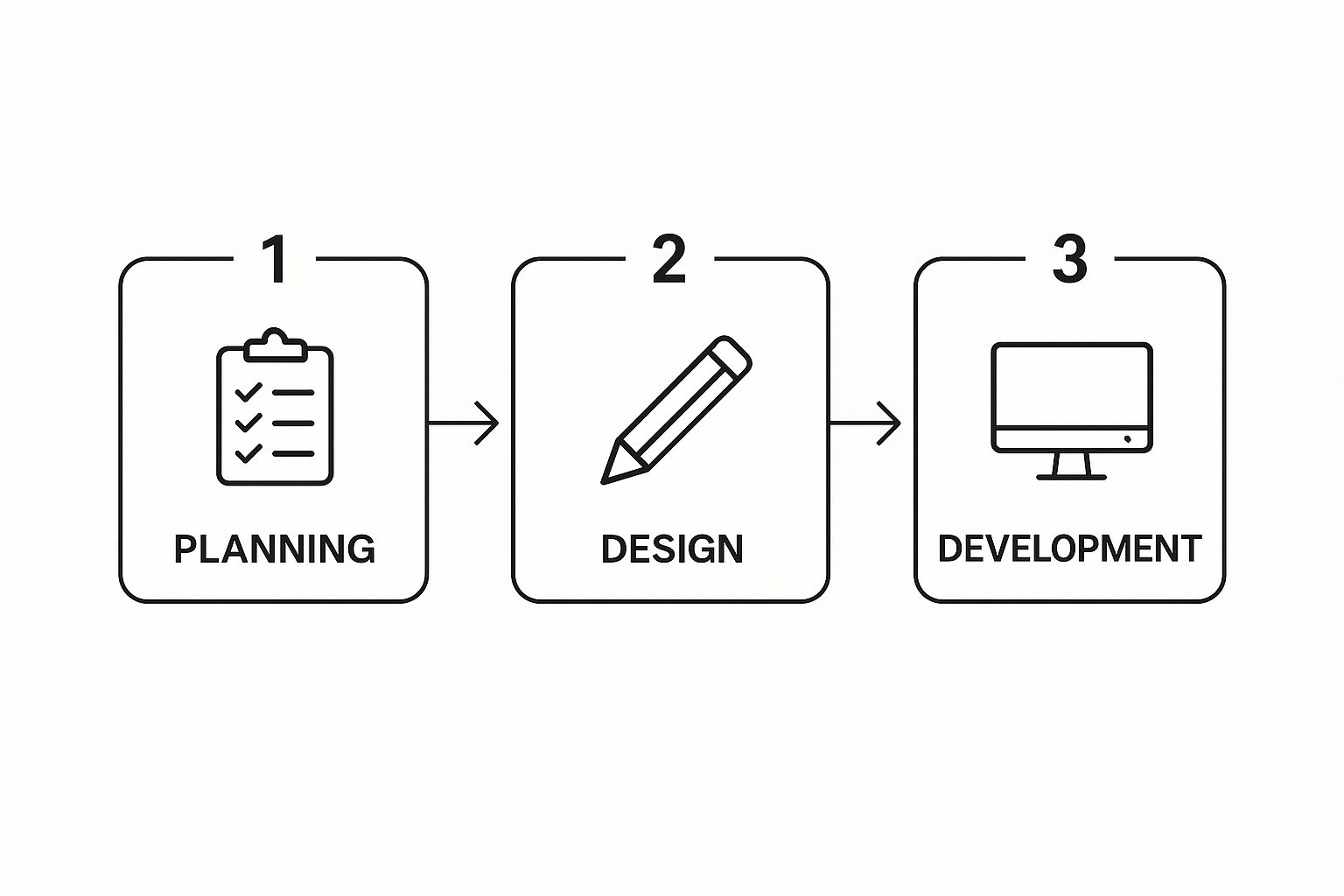
As you can see, a solid plan underpins everything. It’s the essential first step before any of the creative or technical work can truly begin.
By taking the time to nail down your goals, define your brand and audience, and get a feel for the market, you'll end up with a comprehensive project brief. This document is your roadmap, guiding everything from your choice of platform and budget to your list of must-have features, ensuring your ecommerce venture gets off to the strongest possible start.
Designing an Intuitive Shopping Experience
Great ecommerce design isn’t just about looking good; it's about creating a seamless path from browsing to buying. This is where the magic of User Interface (UI) and User Experience (UX) design comes into play, turning casual window shoppers into repeat customers. The goal is to make your site so easy to use that it feels second nature.
The structure of your website is everything. If a customer can't figure out where to go in a few seconds, they're gone. A messy or illogical navigation menu is one of the fastest ways to lose a potential sale.

Crafting a Clear Navigational Path
Think of your website’s navigation like the aisle signs in a supermarket. They need to be clear, logical, and point people straight to what they're looking for. You want to minimise the number of clicks and reduce the mental effort it takes to get around your site.
Start by sorting your products into broad, obvious categories. If you sell clothing, this might be 'Men', 'Women', and 'Children'. Then, break it down further with subcategories like 'T-shirts', 'Trousers', and 'Outerwear'. This kind of layered structure, often seen in a mega menu, helps shoppers zero in on specific items without getting lost.
A powerful search bar is also a must-have. A lot of shoppers, especially those who know exactly what they want, will head straight for it. Make sure your search function includes features like:
- Autocomplete: This suggests products as someone starts typing, speeding things up.
- Filtering and Sorting: Let users narrow down results by price, colour, size, or brand.
- Helpful ‘No Results’ Pages: If a search comes up empty, offer useful suggestions or alternative products instead of a dead end.
Designing Product Pages That Convert
Your product pages are your digital sales team. This is your chance to make the pitch, answer any questions, and give a customer the confidence they need to hit that "Add to Basket" button. A truly effective product page is a perfect mix of stunning visuals and persuasive details.
High-quality images are non-negotiable. People can't touch or feel your products online, so your photos have to do all the work. Use multiple high-resolution shots from different angles, include a zoom function, and think about using video or 360-degree views to really show the product off.
When it comes to the product description, go beyond just listing features. Use your words to sell the benefits. How will this product make the customer's life better? And be sure to answer common questions right there on the page: What are the dimensions? What’s it made of? What's the warranty?
A great product page anticipates a customer's questions and answers them before they even have to ask. By giving them clear, complete information and fantastic visuals, you remove any hesitation and build the trust needed to close the sale.
The Checkout Process: A Masterclass in Simplicity
The checkout is the final hurdle, and it’s where a shocking number of sales fall apart. The average cart abandonment rate is hovering around 70%, and a clunky, confusing checkout is often the culprit. The key here is to simplify, simplify, simplify.
Every extra field, click, or page you add creates friction. Your job is to strip it all away. Always offer a guest checkout option—forcing people to create an account is a massive conversion killer. A simple progress bar that shows customers where they are in the process also works wonders.
To make your checkout as smooth as possible, focus on these elements:
- Minimal Form Fields: Only ask for what you absolutely need. Do you really need their phone number?
- Multiple Payment Options: Give people choices. Offer credit/debit cards, PayPal, and newer options like Apple Pay or Klarna.
- Visible Trust Signals: Display security badges (like SSL certificates) and payment logos clearly to show customers their information is safe with you.
By concentrating on these core design principles, you can build a shopping experience that not only looks professional but is also incredibly effective at turning visitors into loyal customers. To get even more practical advice, check out these 7 ecommerce website design tips you need to know and see how you can further refine your site.
Building Your High-Performance Sales Engine
Right, this is where the magic happens. All those plans, wireframes, and designs are about to become a real, functioning online shop. The development phase is all about turning those visual concepts into clean, efficient code. We’re essentially building the engine for your sales machine—and it needs to be robust, secure, and incredibly fast.
This process is a team effort, typically split between front-end and back-end development.

Think of the front-end as everything your customer sees and touches. It’s the user interface—the product pages they browse, the buttons they click, the checkout form they fill in. The back-end, on the other hand, is the powerhouse working behind the scenes. It’s what manages your product database, processes payments securely, and handles all the complex logic that makes your store tick.
Integrating Your Core Systems
A huge part of ecommerce development is weaving together all the essential third-party services that your store relies on. This isn't just about picking a platform; it's about making sure every single component talks to the others flawlessly.
This involves several critical integrations:
- Payment Gateways: Securely connecting to services like Stripe, PayPal, or Klarna is absolutely non-negotiable. This isn’t a simple plug-and-play; it requires careful configuration to protect customer data and meet strict security standards.
- Shipping and Logistics: Your website needs to communicate directly with your chosen couriers. This means setting up real-time shipping rate calculations based on weight, location, and speed, as well as automating the generation of labels and tracking information.
- Inventory Management: If you hold physical stock, your website must be the single source of truth. Integrating with inventory management software is vital to prevent overselling—a mistake that can seriously damage customer trust.
Building a successful online store is like assembling a high-performance engine. Every component, from the payment gateway to the inventory system, must be perfectly tuned. If one part fails, the entire machine grinds to a halt.
The Unforgiving Need for Speed
In ecommerce, speed isn't just a nice-to-have; it's everything. A slow website is a conversion killer, plain and simple. We’ve seen countless studies showing that even a one-second delay in page load time sends conversion rates plummeting. Your customers expect an instant, frictionless experience, and they won't wait around.
This is especially true here in the competitive UK market, where site performance has a direct and measurable impact on the bottom line. Recent data shows UK ecommerce merchants who prioritised performance saw revenue per visitor shoot up by over 20% year-over-year. Overall sales grew by a massive 32.66%, completely dwarfing the general retail growth of just 1.8%. Those gains are overwhelmingly linked to faster load times and smoother user journeys. You can explore the latest UK ecommerce market data for a closer look.
Achieving this kind of performance isn't an accident. It requires a dedicated optimisation strategy from day one.
Optimisation Techniques for a Blazing-Fast Store
To make sure your site can handle high traffic and deliver a flawless experience on any device, developers use a whole toolkit of optimisation techniques. These aren't afterthoughts; they're woven into the development process from the very beginning.
Here are a few of the most impactful methods we use:
- Image Compression: High-resolution product images are essential, but they can be massive files that bog down your site. We use modern formats like WebP and clever compression to shrink file sizes without sacrificing that crisp visual quality.
- Code Minification: This is a bit of technical housekeeping. We strip out all the unnecessary characters from the website's code—things like spaces and comments that developers use—to make the files smaller and faster for browsers to download.
- Leveraging Browser Caching: Caching is a smart way to tell a visitor's browser to save static parts of your website, like your logo or background images. When they come back, their browser doesn't have to re-download everything, making the site feel almost instant.
- Content Delivery Network (CDN): A CDN is a game-changer, especially for businesses with an international audience. It stores copies of your website on servers located all over the world. When a customer in New York visits your site, the content is delivered from a nearby server, not all the way from London, dramatically cutting down load times.
Focusing on these technical details ensures your online store isn't just functional but is a truly high-performance sales tool. This meticulous approach to speed and reliability is what separates a good online store from a great one. For more strategies on turning visitors into paying customers, check out our guide on https://www.ibertechsolutions.co.uk/ecommerce-conversion-rate-optimization.
Mastering Mobile Commerce for Modern Shoppers
Let's be clear: a mobile-first approach isn't some trendy add-on anymore. It's the absolute foundation of a successful ecommerce store. For a huge, and growing, number of your customers, their smartphone isn't just one way to visit your shop—it's the only way they ever will.
This goes way beyond simply having a "responsive" design that squishes your desktop site onto a smaller screen. True mobile optimisation is about completely rethinking the customer's journey. You have to design for someone navigating with their thumb, often distracted, and with very little patience for a clunky experience.

The image above shows how a layout can adapt across different devices. But while the layout changes, the core principles of great usability—clarity, speed, and simplicity—become even more vital on that smallest screen.
Designing for Touch and Speed
Navigating with a mouse is forgiving; a misplaced click is easy to correct. Tapping with a finger is not. Every single button, link, and interactive element needs to be designed with the "fat finger" problem in mind.
Think about it from their perspective:
- Generous Tap Targets: Buttons and links must be big enough to tap easily without accidentally hitting whatever's next to them. It’s a simple thing, but so many sites get it wrong.
- Intuitive Gestures: People are used to swiping through photo galleries or pinching to zoom in on a product. Don't fight it—build these familiar gestures into your design.
- Simplified Navigation: That sprawling, multi-level menu from your desktop site is a complete nightmare on mobile. A clean "hamburger" menu or a simple, icon-based navigation bar is the only way to go.
Beyond the interface, you have to be obsessed with speed. Mobile users are notoriously impatient. A slow, stuttering site is a guaranteed way to lose a sale before they've even seen your products. Every image needs to be compressed and every bit of code optimised to load instantly over mobile networks.
The Effortless Mobile Checkout
Nowhere is a smooth experience more critical than at the mobile checkout. This is it—the final hurdle. If you make them work for it here, they’ll simply abandon the cart.
Your mobile checkout should feel less like filling out paperwork and more like a simple, guided conversation. Strip out every unnecessary field, every extra click, and every moment of potential confusion. The goal is a path so smooth that the customer barely notices they've completed the purchase.
To get this right, you need to focus on a few key areas:
- Guest Checkout: Never, ever force someone to create an account on a small screen. It’s a massive barrier and a top reason for abandoned carts.
- Digital Wallets: Integrate payment options like Apple Pay and Google Pay. They allow for one-tap payment, completely bypassing the tedious process of typing in card details.
- Minimal Form Fields: Only ask for what is absolutely essential to process the order. Use tools like postcode lookups to auto-fill address fields wherever you can.
The Future of Mobile Shopping
The mobile commerce world is moving fast, with new tech creating richer and more immersive shopping experiences all the time. Building for mobile today isn't just about keeping up; it's about future-proofing your business.
In the UK, the numbers are staggering. Mobile platforms now account for 55% of all ecommerce transaction value, and the market for smartphone-based sales is set to soar past USD 100 billion in 2025. This explosion is powered by tech like widespread 5G, which can slash page-load times by 70% and cut cart abandonment by around 15%. Better connectivity is also unlocking incredible new possibilities, like Augmented Reality (AR), which lets customers virtually "try on" products and has been shown to boost conversion rates by up to 40%. You can dig deeper into the growth of the UK mobile commerce market to see where things are headed.
By making a fast, intuitive, and forward-thinking mobile strategy your top priority, you ensure your online store isn’t just ready for today's shoppers, but perfectly positioned for the customers of tomorrow.
Your Go-Live and Growth Strategy
Flipping the switch to ‘live’ is a massive milestone, but it’s the start of the race, not the finish line. I’ve seen too many businesses pour everything into the initial build, only to stumble right out of the gate. A successful launch is built on meticulous testing, and sustained growth comes from smart, ongoing maintenance. This isn't just about avoiding day-one disasters; it's about setting your store up for long-term success.
Before you even think about announcing your grand opening, a thorough pre-flight check is absolutely non-negotiable. This phase of ecommerce web design and development is where you hunt for any nasty surprises that could ruin your first customers' experience. A single broken link or a confusing payment step can be enough to lose a sale and tarnish your reputation before you've even made your first pound.
Test, Test, and Test Again
Your pre-launch testing needs to be organised and systematic, covering every possible way a customer might interact with your site. It’s not enough to just test the "happy path" where everything works perfectly. You need to actively try to break things.
Think of it this way: what happens if someone tries to apply an expired discount code? What if they enter their postcode incorrectly? These are the real-world scenarios that separate a professional store from an amateur one.
Here’s a checklist I always run through before any site goes live. It’s designed to catch those common but critical issues that can derail a launch.
Your Essential Pre-Launch Testing Checklist
| Test Category | Key Checks | Common Pitfall to Avoid |
|---|---|---|
| User Journey & Functionality | Can you add various items to the basket? Do discount codes work? Test every payment gateway. | Forgetting to test on different browsers (Chrome, Safari, Firefox) and devices. What works on your MacBook might be broken on an Android phone. |
| Checkout & Payments | Is the checkout process seamless? Are shipping options and costs calculated correctly? Does inventory update after a sale? | Assuming the payment processor integration is flawless. Always run a few small, real transactions to confirm money is actually being received. |
| Performance & Speed | How fast does the homepage load on a 3G connection? Are images optimised? Use Google PageSpeed Insights for a real-world score. | Uploading huge, uncompressed product images that slow the entire site to a crawl. This is a common and easily fixed conversion killer. |
| Security & Trust | Is the SSL certificate installed and forcing HTTPS everywhere? Are customer data and payment details handled securely? | Not checking for "mixed content" errors where some page elements are loading over insecure HTTP, which browsers will flag as unsafe. |
Once you're genuinely confident that the site is solid and error-free, you're ready to go live. But your work has only just begun.
Launching your store is like opening the doors to a physical shop for the first time. You wouldn't just unlock it and walk away. You need to be there to watch how customers interact, see what they're drawn to, and fix things that aren't working.
Monitoring What Truly Matters After Launch
After the initial buzz of launch day fades, it's time to get obsessed with data. But don't get lost in vanity metrics like page views. You need to focus on the numbers that actually put money in your bank account.
I recommend tracking these key metrics on a weekly basis, at minimum:
- Conversion Rate: What percentage of visitors are actually buying something? This is your single most important health metric. If it’s low, something is wrong with your pricing, product pages, or checkout flow.
- Average Order Value (AOV): How much does the average customer spend? You can nudge this number up with smart upselling (“Would you like the larger size?”) and cross-selling (“Customers who bought this also liked…”).
- Customer Lifetime Value (CLV): How much is one customer worth to you over time? A high CLV tells you that your customers are loyal and happy to come back, which is far more profitable than constantly finding new ones.
- Cart Abandonment Rate: Where are people dropping off during checkout? This data is gold. It can pinpoint the exact friction point—like an unexpected shipping cost—that you need to fix immediately.
A Strategy for Continuous Improvement
Your ecommerce website isn't a static project; it's a living part of your business that needs constant attention. This means getting into a routine for maintenance and growth. Keep your platform, themes, and plugins updated—this is crucial for patching security holes and ensuring everything runs smoothly.
Above all, listen to your customers. Actively ask for feedback through post-purchase surveys and encourage reviews. Use that real-world insight to decide what to improve next. This data-driven approach is how you consistently refine the shopping experience, making your store better month after month. For more guidance on getting started, our comprehensive guide on how to start an online store provides a detailed roadmap.
For long-term growth, you can start integrating marketing strategies like exploring various ecommerce affiliate programs to expand your reach and drive targeted traffic. This blend of technical diligence and savvy marketing is the real key to turning a successful launch into a thriving business.
Got Questions About Building an Online Shop? We’ve Got Answers.
Even with a solid plan, stepping into ecommerce development can feel like navigating a minefield of questions. It’s a big deal, involving a serious investment of both your time and money, so it’s only natural to have a few things you’re unsure about.
Let’s run through some of the most common questions we hear from business owners just like you. Getting these sorted from the outset helps you set realistic expectations and make smarter decisions right from day one.
How Much Does an Ecommerce Website Actually Cost in the UK?
This is always the first question, and the honest answer is: it depends. The price tag can swing wildly based on what you actually need to achieve.
For a startup or a small business just dipping its toes in the water, a simple, template-based site on a platform like Shopify might only set you back a few thousand pounds. It’s a fantastic way to get started quickly, but you'll be limited in how much you can truly make it your own.
On the other hand, if you're an established brand looking for a completely unique customer experience or have complex back-office needs, you're looking at a more significant investment. A fully bespoke website, perhaps on a more powerful platform like Magento (now Adobe Commerce) or a custom solution, could easily range from £15,000 to well over £50,000.
What pushes the price up? It usually comes down to a few key things:
- The level of custom design and branding involved.
- How complicated your products are (think configurable furniture or personalised gifts).
- The need to integrate with other business systems like your stock management (ERP), customer database (CRM), or accounting software.
Pro Tip: Never accept a one-line quote. A good development partner will give you a detailed breakdown of costs, covering everything from strategy and design to development, testing, and support. This way, you see exactly what you’re paying for.
How Long Will It Take to Build My Ecommerce Site?
This is another "how long is a piece of string?" question, as the timeline is tied directly to the project's complexity.
If you’re going for a straightforward, template-based shop, you could be up and running surprisingly fast—often in as little as 4-8 weeks. This is a great option if you need to get to market quickly with a simple product range.
However, a custom project with unique designs and specific features is a much deeper process. You should realistically budget for 3-6 months from the initial kick-off meeting to the final launch. This longer timeframe allows for all the crucial stages: deep-dive strategy sessions, wireframing and prototyping, custom coding, adding all your content, and thorough bug-squashing. And remember, the project's pace often depends on you – providing timely feedback and content is key to keeping things moving.
What's More Important for an Online Shop: SEO or UX?
This feels like a trick question, because the only real answer is that they are completely intertwined. You can’t have one without the other if you want to be successful.
Think of it like this: SEO is what gets people to your front door. User Experience (UX) is what convinces them to come inside, look around, and actually buy something.
You could have the number one spot on Google, but if your website is a slow, confusing nightmare to navigate, those hard-earned visitors will be gone in a flash. Today's search engines are smart, too. They pay close attention to user behaviour signals—like how quickly people leave your site (bounce rate) or how long they stick around. Those signals are a direct reflection of your UX, meaning a bad user experience can actively harm your SEO efforts.
Do I Really Need a Developer to Maintain My Website?
For any business that's serious about growing, the answer is an emphatic "yes."
While modern platforms make it easy for you to handle day-to-day tasks like adding products or writing a blog post, the technical upkeep is a different story altogether. This isn't just about keeping the lights on; it's about protecting and optimising your investment.
Ongoing maintenance involves critical tasks like applying security patches to ward off hackers, fixing the little bugs that pop up over time, updating apps to ensure they still work together, and fine-tuning performance to keep the site zipping along. Having a developer or an agency in your corner for this stuff means your store stays secure, fast, and reliable, leaving you free to focus on what you’re good at—running your business.
Ready to build an online store that not only looks the part but also becomes a powerful sales engine? The team at Ibertech Solutions Limited specialises in creating bespoke ecommerce websites designed around the unique needs of UK businesses. Get in touch today for a friendly chat and let's start building something great together.