Deconstructing Digital Excellence: What Makes a Website Truly Great?
In a crowded online marketplace, a visually appealing website is merely the starting point. True excellence lies in the seamless fusion of aesthetics, functionality, and user-centric strategy. This article moves beyond surface-level praise to deconstruct what makes a design truly effective. We will dissect some of the best good website design examples from leading global brands, uncovering the specific principles and tactical decisions that set them apart.
You will gain replicable insights into everything from minimalist product showcases and powerful user-generated content integration to developer-focused documentation and memorable brand personality. We focus on the strategic ‘why’ behind these successful designs, providing a clear blueprint of what works.
This analysis is designed to provide actionable strategies you can apply directly to your own web projects. Whether you are an entrepreneur in East Anglia planning a new e-commerce site or a marketing manager looking to refine your company's online presence, these examples offer a masterclass in modern digital strategy. Let’s explore the methods that transform a good website into a great one.
1. Apple – Minimalist Product Showcase
Apple’s website is a masterclass in minimalist design, a principle that prioritises clarity and function over ornamentation. This approach strips away non-essential elements, allowing the products themselves to become the heroes of the page. By leveraging stunning professional photography, generous white space, and concise typography, Apple creates a focused and immersive user journey. This is one of the best good website design examples because it proves that less is often more, creating a sense of premium quality and desire.
The core strategy is to let the product do the talking. For instance, the iPhone product pages use high-resolution images and interactive 360-degree views against clean backgrounds. This forces the user’s attention directly onto the product's design and features without distraction. Navigation is intuitive and linear, guiding visitors from discovery to technical specifications and finally to purchase in a seamless flow.
Actionable Takeaways
- Invest in high-quality visuals: Professional product photography and videography are non-negotiable for this approach. They are the main communicators of value.
- Embrace white space: Use empty space strategically to frame your products, improve readability, and create a sophisticated, uncluttered feel.
- Limit your colour palette: Stick to a simple and consistent colour scheme to reinforce brand identity and avoid visual noise.
- Prioritise performance: A minimalist design should be fast. Optimise images and code to ensure lightning-fast loading times, which is crucial for user experience and SEO.
This infographic breaks down the core visual process Apple uses to achieve its minimalist aesthetic.
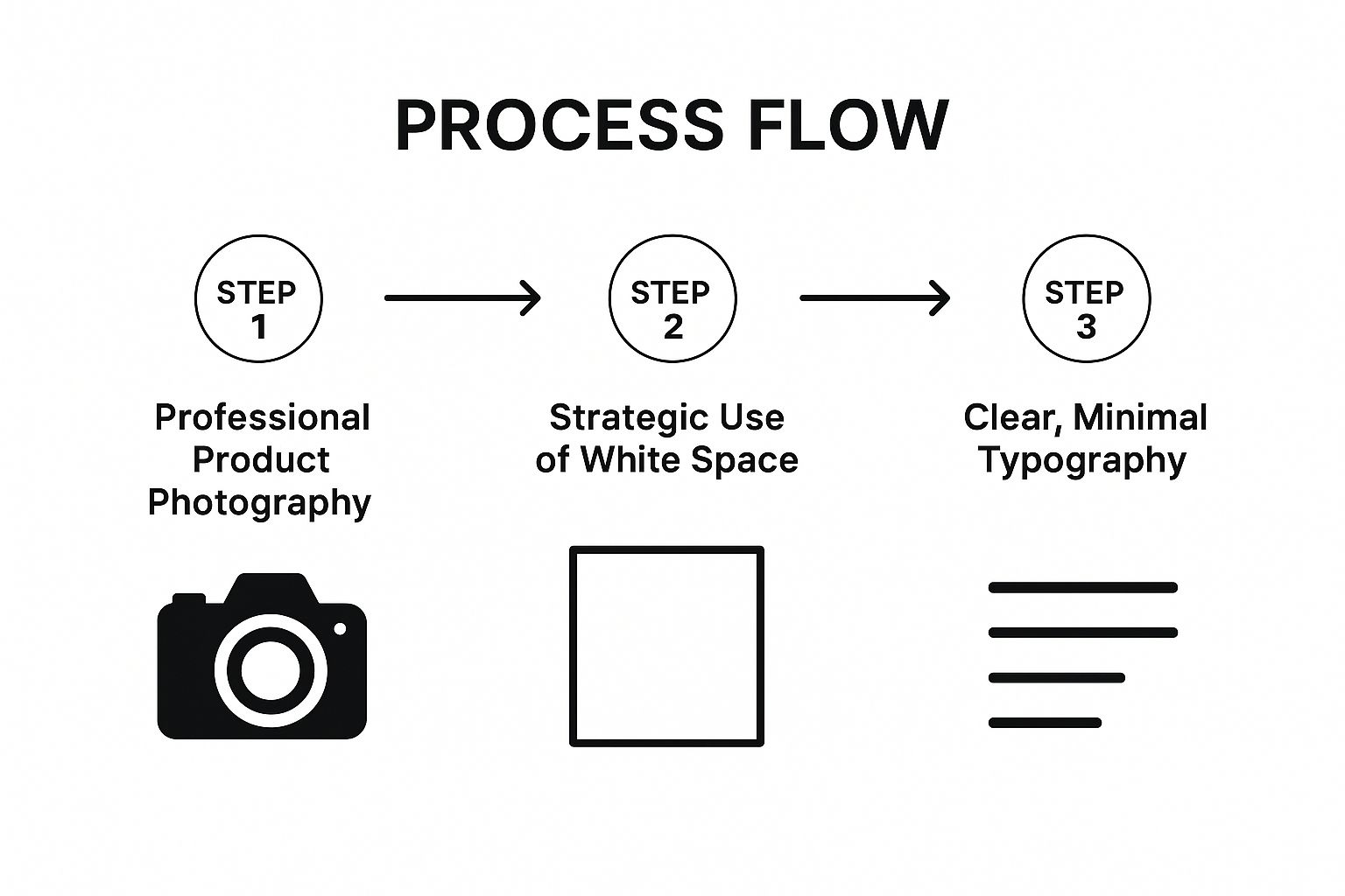
The flow demonstrates that a powerful minimalist design begins with the asset, is enhanced by its surrounding space, and is clarified by typography. For businesses, especially those in eCommerce, this method builds a premium brand perception and guides customers efficiently toward conversion. Even small businesses can apply these principles; discover more about designing a powerful website for your small business.
2. Airbnb – User-Generated Content Integration
Airbnb’s platform excels by masterfully integrating user-generated content (UGC) into a professional, trustworthy design framework. The site uses authentic photography and reviews from hosts and guests, blending them with a clean interface and intuitive navigation. This approach builds instant social proof and credibility, transforming a potentially anonymous transaction into a community-driven experience. This is one of the most effective good website design examples because it turns its user base into its most powerful marketing asset, fostering trust and encouraging bookings.
The core strategy is to place real user experiences at the forefront. Property listing pages are dominated by host-submitted photos, while guest reviews and ratings provide crucial decision-making information. The design organises this high density of information with clever use of icons, clear typography, and an interactive map interface, making a complex search feel simple. Verification badges and detailed host profiles further enhance user confidence, ensuring the platform feels safe and reliable.
Actionable Takeaways
- Establish trust with social proof: Prominently display genuine user reviews, ratings, and photos to build confidence and validate choices for new users.
- Balance UGC with professional design: Frame user content within a clean, well-structured layout to maintain a professional and credible appearance. Avoid a cluttered or chaotic feel.
- Implement a robust verification system: Use visible trust signals like verification badges and clear community guidelines to make users feel secure.
- Prioritise powerful search and filtering: When dealing with vast amounts of user-generated listings, intuitive and detailed search functionality is paramount for a positive user experience.
This model is ideal for marketplaces, community platforms, and travel services where authentic user experiences are central to the value proposition. By prioritising trust and leveraging community content, businesses can create a highly engaging and self-sustaining ecosystem that drives conversions.
3. Stripe – Developer-Focused Documentation
Stripe’s website sets the gold standard for developer-focused design, masterfully blending elegant aesthetics with profoundly functional documentation. The site treats its technical content not as an afterthought but as a core product, making complex financial technology accessible and even enjoyable to work with. By presenting API references with interactive, real-time code examples and logical information architecture, Stripe has created one of the most respected good website design examples for any business targeting a technical audience.
The genius of Stripe's approach is its relentless focus on the developer experience (DX). Integration guides offer clear, step-by-step instructions, while the documentation itself is organised with a two-panel layout that allows users to read explanations alongside live code snippets. This dual-view system, combined with clean typography and a consistent design language, demystifies intricate processes and empowers developers to build and test integrations with speed and confidence.
Actionable Takeaways
- Invest heavily in documentation UX: Treat your technical documentation like a primary user interface. It should be intuitive, searchable, and organised logically.
- Provide interactive examples: Wherever possible, allow users to manipulate code and see the results directly on the page. This hands-on approach drastically shortens the learning curve.
- Use consistent design patterns: Apply the same visual language, from fonts and colours to layout structures, across all technical content to create a cohesive and predictable user experience.
- Test documentation with actual developers: Gather feedback from your target audience to identify pain points, clarify ambiguities, and ensure the information is genuinely helpful and accurate.
4. Medium – Content-First Typography
Medium’s website design championed a content-first approach, establishing a new standard for online reading experiences. Its design philosophy centres on typography and readability, stripping away visual clutter to let the written word take precedence. By meticulously selecting fonts (like the Charter serif typeface for body text), optimising line height and spacing, and enforcing a strict, uncluttered layout, Medium creates an environment where content is not just presented, but respected. This is one of the most powerful good website design examples because it proves that usability and aesthetics can be achieved by prioritising the core user need: comfortable reading.
The platform’s core strategy is to minimise cognitive load. Article pages feature a generous amount of white space and a constrained column width, which prevents eye strain during long reading sessions. This focus is consistent across writer profiles and publication homepages, where a clean, grid-based layout organises content without overwhelming the visitor. The design is intentionally minimalist to ensure the interface never distracts from the author’s message, making it a benchmark for blogs, news sites, and any platform where long-form content is key.
Actionable Takeaways
- Prioritise readability above all: Choose serif or sans-serif fonts that are easy to read on screens. Pay close attention to size, weight, and contrast.
- Optimise line length and spacing: Aim for 50-75 characters per line to facilitate comfortable reading. Use ample line spacing (around 1.5x the font size) to improve legibility.
- Use white space strategically: Frame your content with empty space to guide the reader’s eye and create a calm, focused reading environment.
- Ensure responsive typography: Test your font choices and layouts rigorously across different devices and screen sizes to guarantee a consistent, high-quality experience everywhere.
This typography-led approach is a fundamental component of effective design. For any business that relies on written content to communicate its value, from detailed blog posts to case studies, these principles are essential. You can discover more about what makes a good website design and its essential elements.
5. Shopify – E-commerce Platform Excellence
Shopify's website excels by perfectly balancing its dual role as a marketing tool for prospective merchants and a functional hub for existing ones. It showcases a deep understanding of its audience, from beginners to enterprise-level businesses, by making complex e-commerce concepts feel accessible and achievable. The design builds immediate trust through clear value propositions, transparent pricing, and extensive social proof. This makes it one of the top good website design examples for any platform-as-a-service business aiming to educate and convert simultaneously.
The core strategy revolves around clarity and empowerment. For instance, the homepage guides users through a logical journey, starting with a powerful call-to-action, followed by success stories, feature breakdowns, and comprehensive support resources. The site architecture is meticulously organised, ensuring that whether a visitor is looking for theme examples, app integrations, or pricing details, the information is just a few clicks away. At the heart of this consistency lies a robust Shopify design system that ensures a cohesive experience across all user touchpoints.
Actionable Takeaways
- Prioritise conversion funnel optimisation: Map out your user journeys and remove any friction. Shopify’s streamlined sign-up and onboarding process is a prime example.
- Use social proof strategically: Feature testimonials, case studies, and user-generated content prominently to build credibility and demonstrate value.
- Simplify complex feature explanations: Break down technical features into benefit-driven, easy-to-understand snippets, using icons and visuals to aid comprehension.
- Test your user flows relentlessly: Continuously test and refine key pathways, like the free trial sign-up or the checkout process, to maximise conversions.
Shopify’s approach proves that a platform's website can be a powerful sales engine when it focuses on user empowerment and trust. By demonstrating the potential for success and providing the tools to achieve it, the design effectively turns visitors into customers. For merchants inspired by this model, it’s crucial to apply similar principles to their own storefronts; you can discover more about optimising your own e-commerce site design.
6. Spotify – Data Visualization and Personalization
Spotify's website is a prime example of turning complex user data into beautiful, engaging narratives. It excels at using vibrant colours, dynamic layouts, and deep personalisation to create an experience that feels alive and unique to each visitor. This approach transforms raw listening data into a visually compelling story, particularly with its annual "Wrapped" campaign, making it one of the most effective good website design examples for building user connection and brand loyalty.
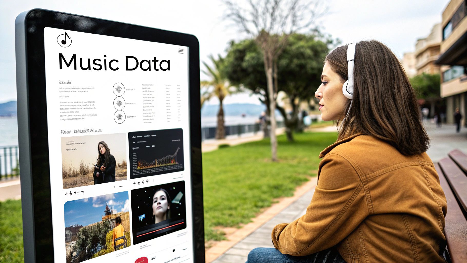
The core strategy is to make users the heroes of their own data stories. Spotify doesn't just present numbers; it visualises moods, top genres, and listening habits with bold typography and energetic animations. This transforms a simple service into a cultural touchstone that users are excited to share. Artist profiles and playlist interfaces continue this theme, presenting streaming data and recommendations in a way that is both intuitive and aesthetically pleasing, fostering a sense of discovery.
Actionable Takeaways
- Implement thoughtful personalisation: Use customer data to tailor content, recommendations, or summaries. This makes the user feel seen and understood.
- Use colour for emotional connection: Choose a vibrant, dynamic colour palette that reflects the energy of your brand and content. Use it to guide attention and evoke specific feelings.
- Balance data with comprehension: Present complex information in a simple, visual format. Infographics, bold stats, and clear charts make data digestible and engaging.
- Create shareable experiences: Design key content pieces, like data summaries or milestone achievements, to be easily shareable on social media. This turns users into brand advocates.
7. Mailchimp – Friendly Brand Personality
Mailchimp’s website excels by infusing a friendly and approachable personality into the often-dry world of marketing automation. This strategy uses playful illustrations, a warm colour palette, and conversational copy to demystify complex technical features. By doing so, Mailchimp effectively lowers the barrier to entry for small businesses and solo entrepreneurs who might otherwise feel intimidated. It stands out as one of the best good website design examples because it proves that a strong, likeable brand personality can build trust and make a functional tool feel genuinely supportive.
The core strategy revolves around humanising the technology. Instead of cold, corporate jargon, the site uses simple, encouraging language. For instance, its help documentation and feature explanations are framed as friendly advice rather than technical directives. This is supported by whimsical animations and a consistent visual identity featuring its mascot, Freddie, which guides users and celebrates their successes, such as sending their first campaign. This creates an emotional connection and a memorable user experience that feels less like using software and more like working with a helpful partner.
Actionable Takeaways
- Develop a consistent brand voice: Create clear guidelines for your copy, defining the tone, language, and personality to be used across all pages.
- Use personality to reduce user anxiety: Employ humour, encouraging words, and friendly visuals in areas where users might feel stressed, such as during setup or payment processes.
- Balance playfulness with functionality: While a fun design is engaging, ensure it never gets in the way of core functions. The user journey to create a campaign or find support must remain clear and efficient.
- Test your brand personality: Ensure your chosen tone resonates with your target audience. What one group finds charming, another might find unprofessional, so gather feedback.
8. Notion – Flexible Information Architecture
Notion’s website excels at organising and presenting a highly complex and versatile product through clean design and an intelligent information architecture. It mirrors the software’s core value proposition: bringing clarity to complexity. The site uses modular layouts, clear hierarchies, and interactive elements to demonstrate the product's power without overwhelming the user. This makes it one of the best good website design examples for any business whose product has multiple features or use cases, proving that depth and simplicity can coexist.
The strategy revolves around showcasing real-world applications. Instead of just listing features, Notion presents a vast template gallery and community success stories. This allows potential users to see themselves in the product, understanding its value through practical examples like project management boards or personal wikis. This use-case-driven approach makes a multifaceted tool feel immediately accessible and relevant, guiding users from abstract curiosity to concrete understanding.
Actionable Takeaways
- Use progressive disclosure: Introduce complex features gradually. Show the basic functionality first and allow users to click for more detailed information, preventing cognitive overload.
- Showcase real-world use cases: Feature a template gallery, case studies, or user testimonials prominently. This helps translate abstract features into tangible benefits for the visitor.
- Maintain a clean visual hierarchy: Despite the volume of information, use generous spacing, consistent typography, and a simple colour scheme to guide the eye and keep the layout feeling organised.
- Leverage community content: Integrate user-generated templates and stories to build social proof and demonstrate the product's adaptability across different needs and industries.
This approach is perfect for SaaS companies, platforms, or any service with a wide range of capabilities. By organising information around user goals rather than just product features, you can create a clear pathway that educates and converts, demonstrating the product’s value in a context your audience understands.
9. Figma – Collaborative Design Showcase
Figma’s website is a masterclass in product-led design, where the site itself becomes a powerful demonstration of its own capabilities. It embodies the principles of modern UI/UX design, using dynamic layouts, interactive elements, and a clean, accessible interface to communicate value. The website showcases collaborative features not just through text, but by visually integrating design workflows and community-created work. This makes it one of the most compelling good website design examples as it proves its product's worth by practicing what it preaches, building immediate trust and demonstrating expertise.
The core strategy is "show, don't just tell". Instead of relying on static screenshots, Figma uses subtle animations and interactive modules that mimic the software experience. For instance, sections on its homepage illustrate real-time collaboration by showing multiple cursors moving simultaneously. This approach effectively communicates complex features in an intuitive and engaging manner, making the benefits tangible for prospective users. The design is meticulously organised, guiding visitors through features, use cases, and educational resources seamlessly.
Actionable Takeaways
- Use your product to demonstrate its capabilities: If possible, build your website using your own tool or integrate its core functions directly into the user experience.
- Showcase real user work prominently: Featuring community designs and templates provides social proof and illustrates the versatile applications of your product.
- Maintain exceptionally high design standards: As a design tool, your website's aesthetics and usability must be flawless to reflect the quality of your offering.
- Integrate educational content: Providing tutorials and resources positions your brand as an authority and helps users succeed with your product, fostering loyalty.
The video above showcases how Figma's design system, which powers both the product and the website, creates a cohesive and professional brand identity. For businesses, particularly in the tech and SaaS sectors, this method is invaluable for converting informed users who appreciate seeing a product in action. By demonstrating functionality directly, you shorten the consideration phase and build a strong case for adoption.
10. Tesla – Immersive Product Experience
Tesla's website redefines the automotive buying journey by creating a deeply immersive product experience. It moves beyond static images, using interactive configurators and stunning visuals to make complex technology feel both accessible and aspirational. This design philosophy mirrors the brand's focus on innovation, turning a simple car purchase into an exciting, futuristic interaction. This is one of the top good website design examples because it transforms the user from a passive browser into an active participant in the design process.
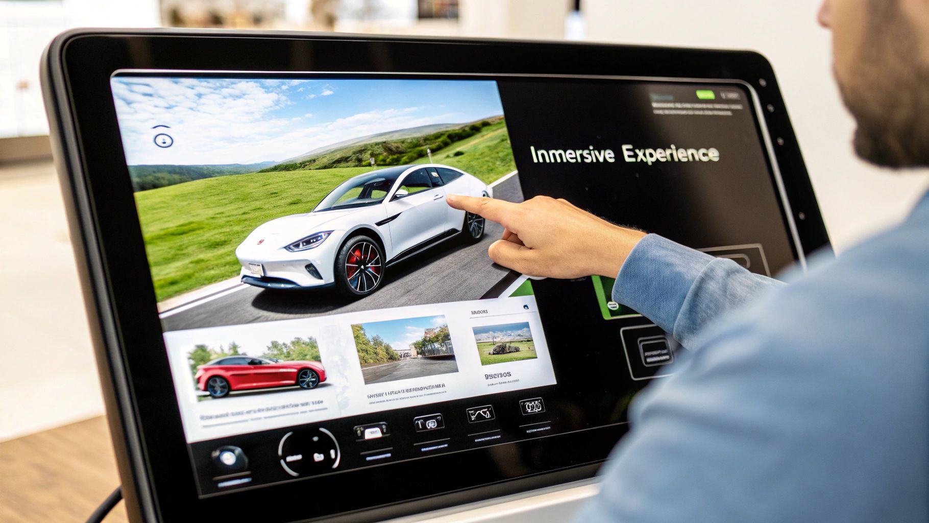
The site’s core strategy is interactive customisation. The vehicle configurator, for example, allows users to select colours, wheels, and interiors, with real-time updates to the visuals and price. This puts the user in control, fostering a sense of ownership before a purchase is even made. Similarly, interactive maps of the charging network and solar panel calculators demystify the surrounding ecosystem, making the switch to electric feel practical and seamless. The design is bold, clean, and focused entirely on the product and its capabilities.
Actionable Takeaways
- Invest in high-quality product visualisation: Use 3D models, high-resolution video, and interactive elements to let users explore your product from every angle.
- Make technical information accessible: Translate complex data into user-friendly tools like calculators or interactive graphics to help customers make informed decisions.
- Create immersive brand experiences: Design your site to reflect your brand's core values. For an innovative brand, the website itself should feel innovative and forward-thinking.
- Optimise for performance despite rich media: Immersive experiences require heavy assets. Aggressively optimise images, videos, and scripts to ensure fast load times and a smooth user journey.
Top 10 Good Website Design Examples Comparison
| Website | 🔄 Implementation Complexity | 💡 Resource Requirements | 📊 Expected Outcomes | ⭐ Key Advantages | 🛠️ Ideal Use Cases |
|---|---|---|---|---|---|
| Apple – Minimalist Product Showcase | Medium (requires design precision and high-quality assets) | High (professional photography and optimization) | Clean, professional appearance; fast loading; strong brand consistency | Exceptional user experience; strong visual hierarchy; brand cohesion | Technology/Consumer Electronics with focus on product presentation |
| Airbnb – User-Generated Content Integration | High (complex architecture and content moderation) | Medium-High (user content moderation, search system) | Trust building; high engagement; intuitive booking flow | Authenticity via user content; advanced search; personalized recommendations | Travel/Hospitality platforms with community input |
| Stripe – Developer-Focused Documentation | High (complex info architecture and interactive elements) | Medium-High (documentation maintenance, developers tools) | Excellent developer experience; technical credibility; detailed docs | Interactive code demos; clear tech communication; systematic design | Financial Technology APIs and developer platforms |
| Medium – Content-First Typography | Low-Medium (focused on typography and minimalism) | Medium (font licensing, content curation) | Superior readability; content focus; clean design | Exceptional typography; distraction-free reading | Publishing/Media platforms prioritizing content readability |
| Shopify – E-commerce Platform Excellence | High (complex checkout flows, feature-rich) | High (merchant tools, educational content) | Conversion optimized; strong trust elements; user-friendly | Optimized sales funnel; social proof integration; comprehensive features | E-commerce platforms targeting merchants and customers |
| Spotify – Data Visualization and Personalization | High (complex data visualization and personalization) | High (data infrastructure, JS-heavy) | Engaging UX; strong brand personality; innovative use of data | Dynamic visuals; personalized user experience; emotional design | Music Streaming/Entertainment with data-driven UX |
| Mailchimp – Friendly Brand Personality | Medium (requires consistent voice and illustration design) | Medium (custom illustrations, UX design) | Memorable brand; reduces user intimidation; excellent onboarding | Playful, approachable design; strong brand voice | Email Marketing/SaaS targeting SMBs and entrepreneurs |
| Notion – Flexible Information Architecture | High (complex, modular layout and content management) | Medium-High (content updates, community integration) | Clear product flexibility; clean design; community engagement | Progressive disclosure; use case clarity; flexibility in structure | Productivity Software/SaaS with versatile features |
| Figma – Collaborative Design Showcase | High (interactive demos, design system maintenance) | Medium-High (design maintenance, community resources) | Demonstrates product capabilities; strong community; high design quality | Product demos; community showcases; collaborative workflows | Design Tools/Software focused on collaboration and product marketing |
| Tesla – Immersive Product Experience | Very High (interactive configurators, rich visuals) | Very High (high-res assets, complex tech presentation) | Immersive brand experience; innovative interactions; strong visual impact | Immersive product showcases; innovation focus; accessible tech info | Automotive/Clean Energy brands with innovation emphasis |
Your Blueprint for a Better Website
Throughout this exploration of good website design examples, a powerful, unifying principle has emerged: exceptional design is never superficial. It's the tangible result of a meticulous, user-obsessed strategy. We’ve seen how industry leaders don't just build websites; they engineer digital experiences. From the disciplined, product-centric minimalism of Apple to the immersive, futuristic storytelling of Tesla, every choice is deliberate, purposeful, and executed with precision.
These examples demonstrate that great design is a conversation. Mailchimp speaks with a friendly, encouraging voice, making complex marketing tools feel accessible. Stripe communicates directly with developers, valuing their time with flawless documentation and clean APIs. Airbnb builds a dialogue of trust through user-generated content and transparent reviews. The common thread is a deep, empathetic understanding of the end-user's needs, goals, and potential frustrations. This is the foundation upon which all other design elements, from colour palettes to information architecture, should be built.
Synthesising the Strategy: Key Takeaways for Your Business
To translate these high-level inspirations into a practical blueprint for your own website, it's crucial to synthesise the core strategies at play. Don't just copy the aesthetics of these good website design examples; adapt their underlying thinking.
Here are the most critical, replicable lessons to guide your next project:
- Prioritise with Purpose: Every successful site we analysed has a clear primary objective on each page. Shopify’s goal is to convert visitors into merchants, so its homepage is a masterclass in benefit-driven persuasion. Ask yourself: what is the single most important action a user should take on this page? Design your entire layout, from headline to CTA, to guide them towards that action.
- Build for Your Audience, Not Yourself: Notion's incredible flexibility is a direct response to its diverse user base, who need a tool that adapts to their unique workflows. A design that resonates with a creative professional (like Figma's collaborative showcase) will differ vastly from one targeting a corporate decision-maker. Conduct thorough audience research to understand their pain points, technical savvy, and what they value most.
- Content is the Cornerstone: A beautiful container is useless without compelling content. Medium’s radical focus on typography and readability proves that when the content is king, the design should serve as its loyal court. Invest in high-quality copy, imagery, and video before you even think about the final layout.
- Friction is the Enemy: The best websites feel effortless. Whether it's Spotify’s hyper-personalised playlists or Tesla’s seamless car configurator, the goal is to remove barriers. Every unnecessary click, confusing navigation label, or slow-loading page is a point of friction that can cause a user to leave. Audit your user journey relentlessly to identify and eliminate these obstacles.
Ultimately, mastering these principles is what separates a simple online brochure from a powerful, growth-driving digital asset. A well-designed website builds brand credibility, fosters customer loyalty, and directly contributes to your bottom line. It becomes your hardest-working employee, operating 24/7 to attract, engage, and convert your ideal customers.
Feeling inspired by these good website design examples but unsure how to apply these strategies to your own business? At Ibertech Solutions Limited, we specialise in transforming these principles into bespoke, high-performance websites for businesses across East Anglia. We build secure, SEO-optimised digital experiences engineered to deliver tangible results.
Ready to build a website that not only looks great but drives growth? Contact Ibertech Solutions Limited today to discuss your project and receive a no-obligation consultation.