Jumping into a new website project can feel a bit like staring at a blank map. It’s easy to feel overwhelmed, but having a solid website design process is the key to turning that uncertainty into a clear, manageable plan. It’s the same structured approach that experienced UK agencies use to keep projects on track, prevent that dreaded scope creep, and deliver a website that genuinely works for your business.
Your Blueprint for a Successful Website
Think of this process as your project's North Star. It’s what separates a website that launches on time and on budget from one that gets lost in a cycle of endless revisions and missed deadlines. This strategic framework guides every single decision, from the first conversation right through to launch day and beyond.
The UK web design industry has certainly had to be resilient. Recent economic shifts have seen the industry’s total income adjust, with revenues reported at around £640.6 million for 2025. While this reflects more cautious spending from businesses, it also underlines just how crucial professional design is to the wider UK economy.
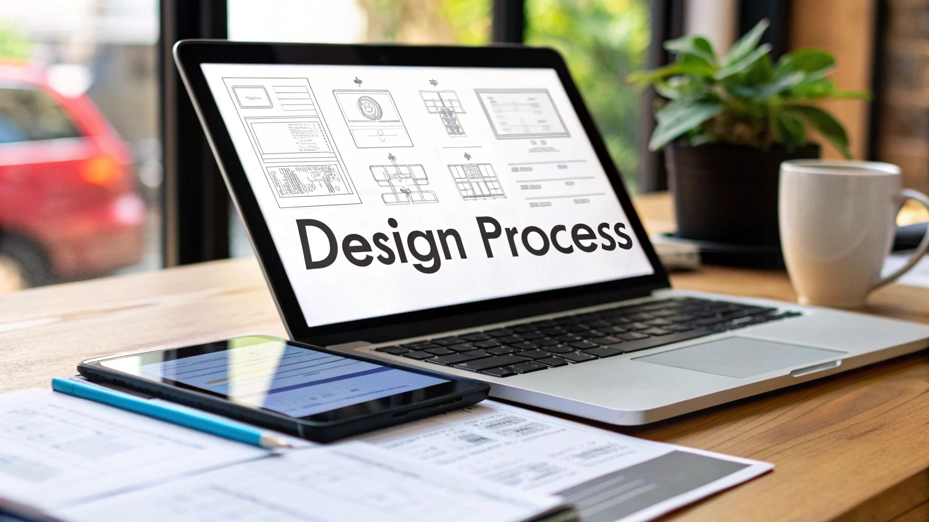
The Core Phases of Web Design
To make sense of it all, the entire journey is broken down into distinct, logical phases. Each stage builds on the one before it, which is how you end up with a cohesive and effective final product.
Here’s a quick overview of what that journey looks like. Think of it as the 'what' and 'why' for each step of the process.
The Core Phases of Web Design
| Phase | Primary Goal | Key Activities |
|---|---|---|
| Discovery & Strategy | Align business goals with project scope | Stakeholder interviews, competitor analysis, KPI setting |
| Wireframing & UX | Map out the website's structure and user flow | Sitemaps, low-fidelity wireframes, user journey mapping |
| Visual & UI Design | Create the look, feel, and brand identity | Colour palettes, typography, imagery, style guides |
| Development & Testing | Build and rigorously test the functional website | Front-end/back-end coding, responsiveness checks, QA testing |
| Launch & Optimisation | Deploy the site and monitor its performance | Going live, analytics review, ongoing maintenance |
As you can see, it's a comprehensive roadmap that ensures nothing important gets missed along the way.
A well-defined process doesn't just manage tasks; it manages expectations. When everyone from the client to the developer understands the "why" behind each step, collaboration improves, and the project stays on track.
Before we dive deeper into each of these specific phases, it helps to have a good grasp of the general web design principles that underpin all of this work. Getting familiar with these fundamentals will give you a much stronger footing.
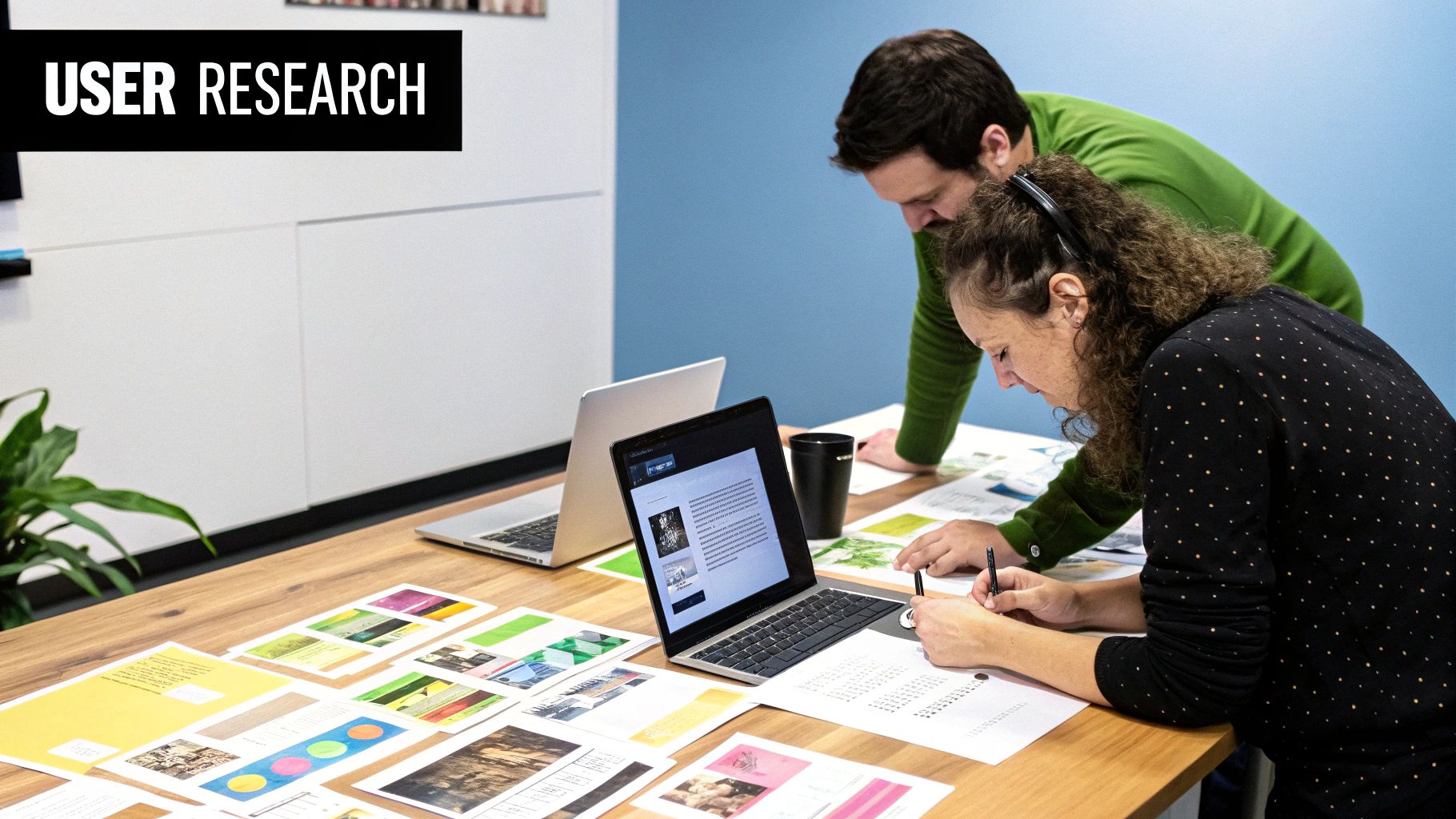
Building a Foundation with Discovery and Strategy
A website's success is rarely down to a stroke of design genius; it’s determined long before the first pixel is pushed. The initial discovery and strategy phase is where we lay the groundwork, swapping vague assumptions for solid data to create a blueprint for the entire project. This is all about digging deep to understand the real commercial objectives driving the need for a new site.
It means running focused stakeholder interviews to get to the heart of the business goals, not just a surface-level wish list of features. For instance, a client might say, "we need a blog." But a proper strategy session uncovers the real goal: "we need to increase organic leads by 20% in the next year." The blog then becomes a specific tactic to achieve that measurable outcome.
Defining the Project Scope
If there's one document that can make or break a project, it's the project brief. Think of it as your North Star, keeping everyone—from designers and developers to the client—aligned and on the same page. This document needs to meticulously outline the project's goals, target audience, key performance indicators (KPIs), and any technical requirements.
To get this right, you need to map out the entire workflow. Exploring different process mapping techniques can be a massive help here. It allows you to visualise every stage and responsibility, ensuring no critical step gets missed along the way.
A great strategy doesn't just list what to do; it also defines what not to do. This is your best defence against scope creep, ensuring every feature serves a clear, strategic purpose and respects the budget and timeline.
This foundational work is more important than ever, especially in the UK. With internet access in 96% of households in Great Britain back in 2020, the expectation for a seamless digital experience is incredibly high. This connectivity has fuelled a thriving market, with web design industry revenue projected to hit around £658.2 million in 2025.
Visualising the User Flow
Once the strategy is locked in, we can start to translate those abstract ideas into tangible structures. This is where we begin to truly visualise how a person will move through and interact with the new site.
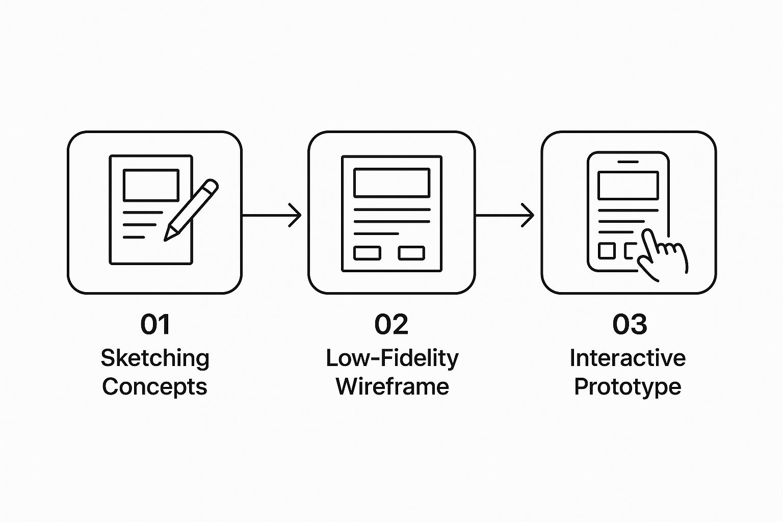
This visual journey, from simple sketches to interactive guides, is fundamental. It really highlights why we always start with low-fidelity wireframes. It lets us test layouts and user pathways quickly, getting feedback and making changes before a single minute is spent on detailed, high-fidelity design. This iterative approach is the best way to ensure the final product is built around a user experience that has already been tested and proven.
Designing the User Journey with Wireframes
Once your strategy is nailed down, the website design process gets real. We move from abstract ideas to concrete structures, basically building the skeleton of your website. This is where we meticulously map out how a visitor will move through your site, ensuring every single click has a clear purpose.
It all starts with something called Information Architecture (IA). Think of this as the science behind organising your website's content in a way that just makes sense. A good IA means visitors can find what they need instinctively. A bad one is like a supermarket hiding the milk in the cleaning aisle—frustrating and a sure way to lose customers.
From Sitemaps to Low-Fidelity Wireframes
First, we lay everything out with a sitemap. This is a simple flowchart of your entire website, showing every page and how they all link together. It’s the bird's-eye view that prevents us from getting lost in the details later on.
With the map in hand, we create low-fidelity wireframes. These are very basic, black-and-white layouts. There's no colour, no fancy fonts—just pure structure and function. They're the architectural blueprints for each page, showing exactly where things like menus, buttons, and contact forms will sit. This approach allows for quick changes and feedback without getting bogged down in visual design.
I’ve seen so many projects get derailed because the team jumped straight into a full-colour design. Using low-fidelity wireframes first is your best defence against expensive do-overs. Making changes at this blueprint stage is fast and inexpensive, letting you fix structural problems before a single pound is spent on visual details.
This user-first approach is what makes a website feel intuitive. For an e-commerce site, for example, it means creating a seamless path from finding a product to checking out. If you want to get this right, you can find more practical advice in our guide covering essential eCommerce website design tips you need to know.
Ultimately, this phase isn't just a box-ticking exercise; it's about building your site on a solid foundation of usability. By mapping the user journey first, you create an online experience that feels natural and effortlessly guides visitors toward achieving your business goals.
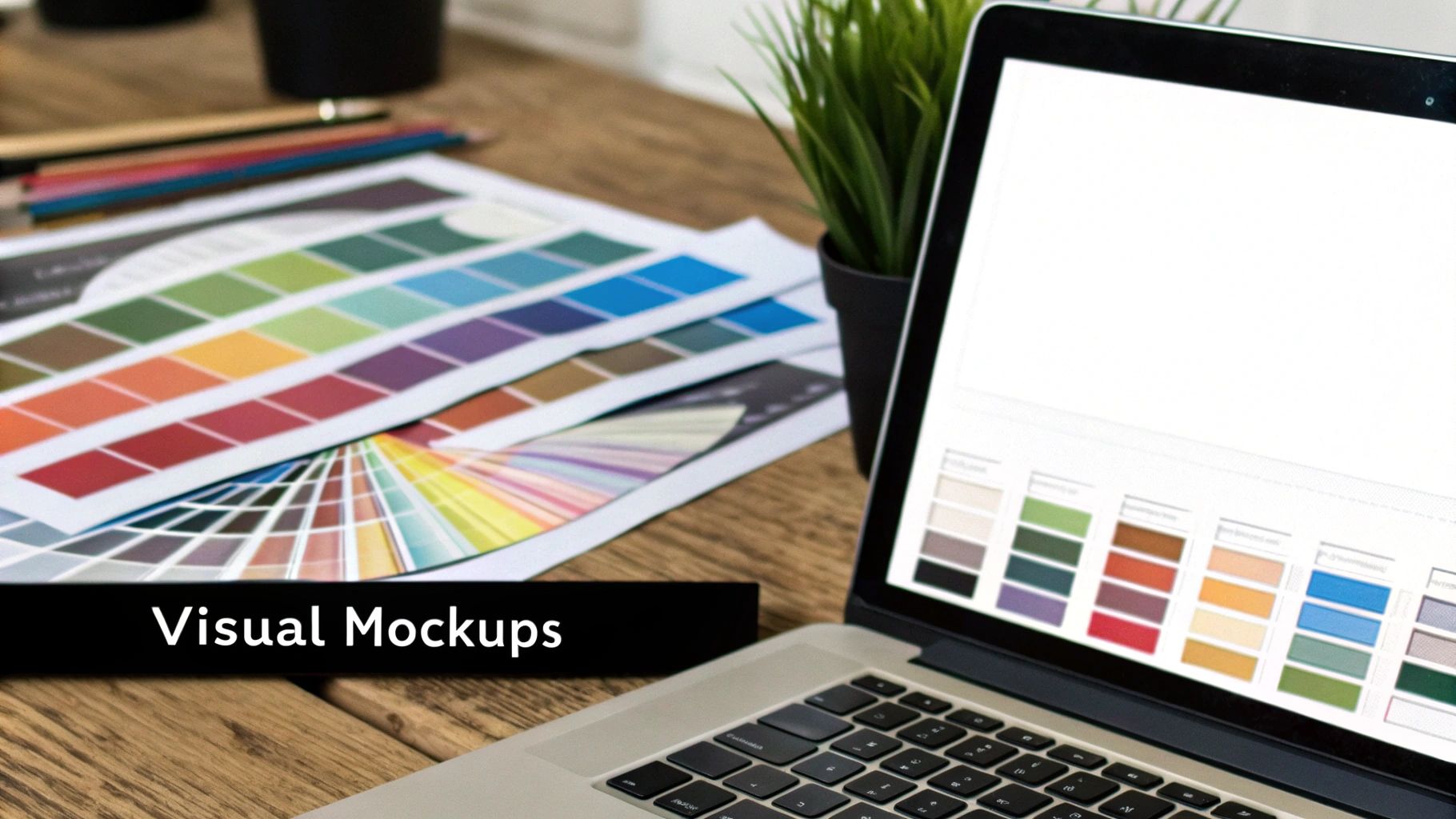
Bringing Your Brand to Life with Visual Design
This is the moment your website’s skeleton gets its skin. The wireframes have given us the structure, but the visual design phase is where we infuse your brand’s personality and transform that functional blueprint into a digital experience that truly feels like you. It’s a common misconception that this is just about picking pretty colours. In reality, it's about crafting a deliberate visual language for your brand online.
A strong user interface (UI) isn't just about looking good; it's about guiding the user without them even realising it. Think about a brightly coloured call-to-action button. That's not just a random design choice. It's a strategic visual cue, carefully placed to draw the eye and prompt a click. This is how we translate your brand identity into a website that not only looks memorable but works effectively.
Crafting a Cohesive Visual System
Consistency is everything when it comes to brand perception. Your website's visual identity needs to feel unified from the homepage to the contact form. This means creating a system where every single element works in harmony, reinforcing your brand's message and professionalism on every single page.
This system is built from a few core components:
- Colour Palette: We'll define a set of primary and secondary colours that echo your brand's personality. These will then be applied consistently across all headings, buttons, backgrounds, and other key elements.
- Typography: The fonts we choose for headlines and body text matter enormously. They must be on-brand, but just as importantly, they have to be perfectly readable on any device, from a large desktop monitor to a small mobile phone.
- Imagery Style: Are your brand's visuals sharp and corporate, or warm and authentic? We'll define a clear style for all photography and graphics to ensure your website tells a consistent visual story.
A classic mistake I often see is when design elements are chosen in isolation. A great visual system ensures that all the parts—the colours, the fonts, the images—work together seamlessly. This consistency is fundamental to building brand recognition and is a hallmark of truly effective web design.
Getting a handle on how these visual pieces fit together is crucial. For a more detailed look, you might find our guide on what makes a good website design and its essential elements really helpful.
Ultimately, this stage is about making sure your website doesn't just work well, but that it also forges a genuine emotional connection with your visitors. It’s about creating a look and feel that resonates, builds trust, and makes your brand impossible to forget.
From Design to Deployment: Testing and Launching Your Website

Once the visual designs get the nod, the website design process shifts into a more technical gear. This is where we bring the static mock-ups to life, building a fully functional website. The work typically splits into front-end development (everything your visitors see and interact with) and back-end development (the server-side engine that makes it all work).
This stage is all about precision. Every button needs to work, every form must submit flawlessly, and every link has to lead to the right place. In the current UK market, there's no room for error. Interestingly, while some global markets are growing, UK web design revenues have actually seen a slight annual dip of around 0.2% between 2020 and 2024. This pressure just highlights how crucial it is for developers to deliver impeccable, high-performing websites. You can read more about the UK's web design sector on sortlist.co.uk.
Your Pre-Launch Quality Checklist
The most important work often happens right before the website goes live. I’ve seen it time and again: a chaotic launch day is nearly always the result of a rushed or skipped testing phase. Think of a structured quality assurance (QA) stage as your best insurance against post-launch stress. It’s what ensures the site you unveil is robust, secure, and professional from the moment that first visitor arrives.
Before you even think about hitting that "go live" button, your website needs to pass a series of tough checks:
- Cross-Browser Compatibility: Your site must look and behave perfectly on all major browsers like Chrome, Firefox, Safari, and Edge. Trust me, what renders beautifully in one can look broken in another.
- Mobile Responsiveness: We don’t just check a single mobile view. We test across a range of devices—iPhones, Androids, and tablets—to confirm the experience is seamless everywhere, not just on a developer’s big screen.
- Performance Optimisation: Slow websites lose visitors and get penalised by search engines. We meticulously analyse and tweak page load speeds to make sure they're lightning-fast.
- Foundational SEO: This means checking that every title tag, meta description, and image alt text is correctly in place. It’s about giving your site a solid foundation for search rankings right out of the gate.
A successful launch isn’t the end of the website design process; it’s the beginning of its life online. Think of it as passing your MOT—the car is road-worthy, but now the real journey of monitoring, maintaining, and improving it begins.
This testing phase might seem exhaustive, but it's absolutely non-negotiable for a smooth launch. If you're planning on updating an existing site, our comprehensive website redesign checklist offers even more detailed guidance. Following these steps helps make sure your launch day is a celebration, not a crisis.
Common Questions We Get Asked
Even with the best plan in place, it’s natural to have questions pop up along the way. That’s perfectly normal. We've put together some straightforward answers to the queries we hear most often, so you can feel confident about what to expect.
How Long Does a Website Design Project Take?
This is a bit like asking "how long is a piece of string?" because the timeline really depends on what we're building. For a straightforward, five or six-page "brochure" style site, we're usually looking at around four to six weeks from start to finish.
On the other hand, if you need a large e-commerce platform with hundreds of products, complex payment systems, and other specialised features, the project could easily stretch from three to six months, sometimes even longer. Things like how quickly you can provide feedback, when the content is ready, and how many changes are needed all play a big part. A solid, detailed brief at the very beginning is your best friend for setting a realistic timeline.
One of the biggest hold-ups we see? Waiting on content. If you have your text, images, and other bits and pieces ready to go when we need them, you'll be amazed at how much faster the whole process moves.
How Much Does a New Website Cost?
Just like the timeline, the cost comes down to the size and complexity of the job. A simple website built from a pre-existing template is always going to be the most budget-friendly option. A completely bespoke design, created from scratch just for you, will naturally be a bigger investment.
The main things that influence the final price are:
- Custom Design vs. Template: A unique, one-of-a-kind design costs more than a ready-made template.
- Number of Pages: The more pages you need, the more design and development work is involved.
- Special Features: Adding things like e-commerce, booking systems, or a members-only area will increase the cost.
- Content Creation: Will you be writing the text and sourcing images, or do you need us to handle that?
Think of it like building a house. A standard new-build is more affordable than an architect-designed home with all the bespoke trimmings. The best thing to do is have a frank conversation with us about your budget and what you want the website to achieve for your business. That way, we can find the right fit.
What Happens After My Website Goes Live?
Getting your site online isn't the end of the journey; it's just the beginning. Think of it as the starting line. To make sure your website stays secure, fast, and doing its job properly, ongoing support and maintenance are essential.
This usually involves regular software updates, security scans, keeping an eye on performance, and taking frequent backups. This kind of aftercare protects your investment and makes sure your site keeps working hard for your business long after launch day.
Ready to get a website that's designed for growth? At Ibertech Solutions Limited, our Norfolk-based team specialises in creating bespoke websites that get real results. Contact us today for a free consultation and let's start building your digital future.