So, what's a 'good' ecommerce conversion rate for a UK business? If you're looking for a quick answer, the general benchmark sits somewhere between 2.5% and 3.5%. But honestly, that figure is just a starting point.
What’s truly ‘good’ is entirely relative. It’s shaped by what you sell, how much it costs, and where your visitors are coming from.
What Is a Good Ecommerce Conversion Rate in the UK?
Trying to pin down a single "good" conversion rate is a bit like asking for the "right" price for a house—it depends on the location, the size, and the market. For an online store, your conversion rate is a core health check. It simply measures what percentage of your visitors end up buying something.
But fixating on a universal average can send you down the wrong path. Imagine a store selling bespoke, handcrafted furniture. A 0.5% conversion rate could be fantastic for them. Now, picture another business selling trendy, low-cost phone cases. For them, a 4% rate might feel like a failure. It's all about context.
Why Your Industry Matters
Customer behaviour isn't one-size-fits-all. Different industries see completely different buying journeys. Someone might research a £1,500 laptop for weeks before committing, but they could impulse-buy a £15 t-shirt in minutes. This difference shows up directly in the conversion rate data.
Recent figures suggest the average ecommerce conversion rate in the UK is about 3.4%, which is actually quite healthy compared to the wider EMEA average of 1.1%. If you narrow it down to platforms like Shopify, the UK average is closer to 1.4%. The best-performing stores on the platform push past 3.2%, while the very top tier hits over 4.7%. You can discover more insights about these 2025 benchmarks to see how you stack up.
To give you a clearer idea of where you might stand, here’s a breakdown of performance tiers for UK online stores.
UK Ecommerce Conversion Rate Benchmarks
This table offers a snapshot of conversion rate performance tiers, helping you gauge where your UK online store currently sits.
| Performance Tier | Typical Conversion Rate | What This Means |
|---|---|---|
| Needs Improvement | Below 1.0% | There's probably significant friction in your customer journey that needs looking at. |
| Average Performer | 1.0% – 2.0% | Your store is working, but there are clear opportunities to improve performance. |
| Strong Performer | 2.0% – 3.5% | You're doing better than most competitors and have a really solid foundation. |
| Top Tier | Above 3.5% | Your store delivers a fantastic user experience and is brilliant at turning visitors into buyers. |
Seeing these numbers can help you set realistic goals for your own ecommerce conversion rate optimisation.
Factors That Influence Your Rate
Looking beyond industry averages, a few key things can either lift your conversion rate or drag it down. Getting a handle on these is the first real step to improving your store's performance.
Some of the biggest influencers include:
- Traffic Source: A visitor from a highly targeted email campaign is almost always more likely to buy than someone who just clicks a general social media ad.
- Product Price Point: It’s just common sense—more expensive items have lower conversion rates because they require more thought and commitment from the buyer.
- Device Type: In the UK, mobile conversion rates still often trail behind desktop. This makes a flawless mobile checkout experience absolutely essential.
- Brand Recognition: If you're a well-known brand, you already have a head start. That built-in trust gives conversion rates a natural boost.
The most important benchmark is always your own. Your goal isn't just to beat an industry average; it's about making consistent, meaningful improvements. Pushing a 1% conversion rate up by just 10% is a huge win.
Finding the Leaks in Your Conversion Funnel
You can't improve what you don't measure. And you certainly can't fix what you can't find. When it comes to real e-commerce conversion rate optimisation, a quick look at your final sales numbers just won't cut it. You need to become a detective, methodically investigating your customer’s journey to find the exact spots where they lose interest and click away.
This whole process is what we call a conversion funnel audit, and it's your roadmap to higher profits.
Think of your website like a physical shop. Are customers walking in, picking something up, and then just abandoning it on a random counter before walking out? A funnel audit helps you see precisely where that happens online. Instead of guessing, you get to observe what people are actually doing and pinpoint the friction points that are costing you sales.
Using Data to Uncover Problem Areas
Your first port of call should always be a robust analytics tool. For most of us, that means Google Analytics 4 (GA4). It’s here that you'll find the hard data on what’s happening across your site. Don't just get fixated on the overall bounce rate; dive into the reports that show you which specific pages have the highest exit rates. Is there one particular product page that seems to repel visitors? Or is your delivery information page causing a mass exodus?
This GA4 funnel exploration report, for example, shows the drop-off at each stage of the customer journey, from the first visit right through to purchase.

The data here clearly highlights a significant drop between the "add to cart" and "begin checkout" steps. That’s a massive clue, pointing towards a potential issue within the cart page itself.
Once you’ve identified a high-exit page, your real job begins: figuring out why people are leaving. This is where you blend the quantitative data from GA4 with qualitative insights from other tools. You have to understand the human experience behind the numbers.
A common mistake I see is people optimising the wrong pages. If a page has very little traffic but a high exit rate, it’s not your priority. Focus your initial efforts on high-traffic pages where even a small improvement can have a massive impact on your revenue.
Seeing Your Site Through Your Customers' Eyes
To truly get inside your users' heads, you need tools that show you what they see and do. This is where heatmapping and session recording software becomes invaluable.
- Heatmaps: Tools like Hotjar or Microsoft Clarity create visual overlays on your pages. They show you exactly where users click, how far they scroll, and what they pay attention to. A "cold" (blue) call-to-action button is an immediate red flag that needs investigating.
- Session Recordings: These are anonymised videos of real people interacting with your site. Watching these is like looking over a customer's shoulder. You can literally see them hesitate, rage-click on a broken link, or struggle to find the information they need.
Imagine you run an online clothing store. Your analytics show a huge drop-off on your checkout page. After watching a few session recordings, you notice users repeatedly trying to enter a discount code, but the field is tucked away and hard to find. Frustrated, they leave to search for a code online and, more often than not, they never come back. That insight is gold.
Another classic real-world scenario involves the shipping form. You might discover from recordings that your form doesn't auto-populate addresses correctly or asks for unnecessary information, creating just enough friction to drive potential buyers away. Keeping an eye on the latest e-commerce trends can help you stay ahead of what customers expect, like streamlined checkouts and diverse payment options. For more ideas, you can read about top ecommerce trends to boost your business on our blog.
Turning Insights into Testable Hypotheses
The final piece of the audit is to turn these data points and observations into clear, testable hypotheses. You're no longer making changes based on a gut feeling; you're making informed decisions backed by solid evidence.
Using the examples above, your hypotheses might look something like this:
- Observation: Users are rage-clicking the "promo code" text because the input box is not obvious.
- Hypothesis: By making the discount code field more prominent on the cart page, we believe we can reduce cart abandonment by 15%.
- Observation: Heatmaps show our customers aren't scrolling far enough to see our shipping policy highlights.
- Hypothesis: By moving key shipping information (e.g., "Free UK Delivery Over £50") to the top of the product page, we think we can increase the add-to-cart rate by 10%.
Each hypothesis gives you a specific, measurable goal for your first round of A/B tests. This structured approach is the very core of effective e-commerce CRO, transforming guesswork into a predictable system for growth.
Winning the Conversion Battle on Mobile
It's no secret that mobile is a big deal. But here in the UK, "big deal" doesn't quite capture it. For anyone serious about ecommerce conversion rate optimisation, you have to realise mobile isn't just another channel—it’s the primary battlefield where most of your sales are won or lost.
Simply having a 'mobile-friendly' or responsive design is table stakes now. The real gains, the ones that move the needle, come from adopting a genuine mobile-first mindset.

This means every new feature, every page layout, and every marketing campaign needs to be thought of and judged through a mobile lens first. A desktop experience crammed onto a smaller screen creates friction, and friction is the ultimate conversion killer. What’s a minor annoyance on a desktop can feel like a complete roadblock on a phone.
Design for Thumbs, Not Cursors
Take a moment and think about how you actually use your phone. Chances are it's one-handed, with your thumb doing all the heavy lifting. This simple, real-world observation should fundamentally change how you approach mobile design.
Your site's layout must respect the ‘thumb zone’—that is, the area of the screen your thumb can comfortably reach. All your key interactive elements have to be placed where they are dead easy to tap.
- Buttons: Make your call-to-action buttons big, obvious, and generally centred. Try to avoid tucking important links or buttons into the top corners of the screen; from experience, these are often the hardest spots to reach.
- Navigation Menus: The ‘hamburger’ menu is pretty standard, but pay close attention to the links inside it. Make sure they're well-spaced. Accidentally tapping the wrong link is an incredibly common frustration that sends people away.
- Forms: Keep forms as short as humanly possible. A great trick is to use the phone’s native features, like bringing up the numeric keypad for phone numbers or the email keypad for addresses, to make typing faster and less of a chore.
A responsive design ensures your site works on mobile. A mobile-first design ensures it's actually enjoyable to use on mobile. That subtle distinction is precisely where conversions are found.
Streamline the Mobile Checkout Experience
The mobile checkout is where the fight gets most intense. Any hint of hesitation or difficulty here, and you've lost the sale. Your one and only goal is to make paying feel completely effortless.
The data speaks for itself. By 2025, mobile is expected to account for a staggering 60% to 70% of all UK online transactions. Projections show mobile commerce retail sales in the UK will surge to £100 billion by 2025, cementing its crucial role. This isn't just a trend; it's a fundamental shift. Retailers who've obsessed over improving their mobile site speed and user experience have often reported doubling their conversion rates. It’s definitive proof that a simple responsive design isn’t enough. You can see more detailed UK revenue data on Statista.
One of the most effective ways I've seen to slash that friction is by embracing digital wallets.
Digital Wallet Integration
| Payment Option | Why It Boosts Conversions | Implementation Tip |
|---|---|---|
| Apple Pay | Lets users check out with a single tap using Face ID or Touch ID, completely bypassing form fields. It's incredibly fast. | Make sure the Apple Pay button is displayed prominently at the very top of your checkout options. |
| Google Pay | Offers a similar one-tap payment for Android users, pre-filling all the necessary info from their Google account. | You need to offer this alongside other methods to cater to the massive Android user base in the UK. |
| Shop Pay | If you're using Shopify, Shop Pay securely saves customer details for a lightning-fast checkout across all stores in its network. | Be sure to enable Shop Pay and even briefly explain its benefits to first-time shoppers. |
Optimise for Real-World Connections
Finally, never forget that your mobile users are rarely on a perfect Wi-Fi connection. They might be on a shaky 4G signal on the train or using patchy public Wi-Fi at a café. Page speed isn't just some technical metric for developers; it's a core, unmissable part of the customer experience.
Be ruthless with image compression for mobile, minimise heavy scripts, and test your site's speed on simulated 3G and 4G networks. Every single second you can shave off your load time is a direct investment in your mobile conversion rate. When you start focusing on these mobile-specific details, you move beyond basic responsiveness and begin crafting experiences that people genuinely want to use—and buy from.
Optimising Product and Checkout Pages That Convert
The path from seeing a product to clicking "buy now" is incredibly delicate. Think of it as a bridge; any crack or wobble can make a customer turn back. This is why strengthening your product and checkout pages is so crucial. You're not just tweaking a website; you’re guiding hesitant visitors into becoming confident buyers.
Product pages and checkout pages have different jobs, but they work as a team. The product page has to spark desire and answer every little question a shopper might have. Then, the checkout page needs to make paying for it all feel effortless and completely secure. Get both right, and you’ll see your sales cross the finish line more often.
Crafting Product Pages That Build Confidence
Your product pages aren't just online catalogues; they're your best salespeople. Their entire purpose is to convince a visitor that your product is the solution they've been searching for. This means you need to stop just listing features and start showing customers what your product will do for them.
- Write with Benefits in Mind: Don't just say, "This rucksack has a 20-litre capacity." Instead, frame it as a solution: "Comfortably carry everything you need for a day trip with a spacious 20-litre capacity." One is a spec; the other is a promise.
- Show, Don't Just Tell: High-quality images from every angle are the bare minimum. Where you can really make an impact is with video. A quick clip of someone actually using the product gives it a sense of scale and context that photos can't quite capture.
- Use Social Proof to Your Advantage: Customer reviews and star ratings are powerful trust signals. Try placing a couple of your best, most detailed reviews right on the page. It’s an instant dose of reassurance for someone new to your brand.
It's also worth looking into authentic, user-generated videos that drive results. These raw, unpolished clips from real customers can feel more genuine than a slick, professional ad, building a level of trust that's hard to replicate.
Just look at the impact a single, well-chosen change—like adding a compelling video—can have when A/B tested.
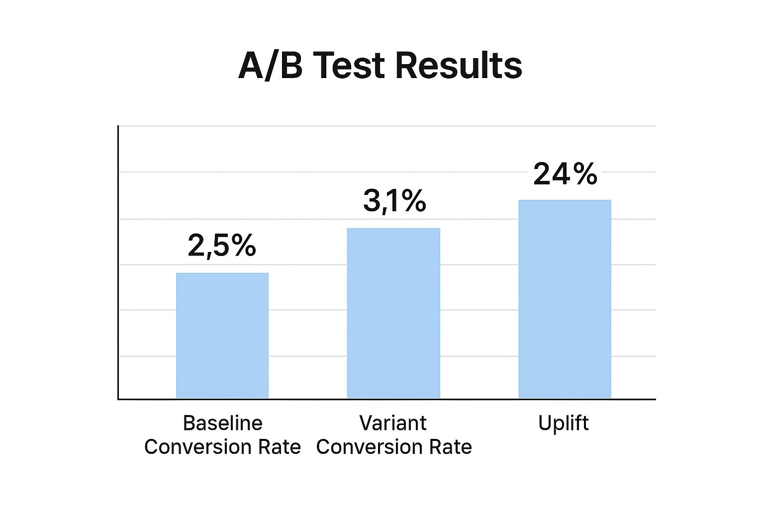
The results speak for themselves. The new version delivered a massive 24% uplift in conversions. It’s a perfect example of how one smart change can lead to serious gains.
Removing Friction from Your Checkout Process
Once a customer has added an item to their basket, your one and only job is to make paying as painless as possible. The checkout is a notorious drop-off point, where an eye-watering 70% of online shopping carts are abandoned. Why? Usually, it's down to unexpected costs or a process that just feels like too much work.
The best checkout is one the customer barely remembers. It should feel so natural and quick that the process becomes almost invisible. Any step that makes a user stop and think is a risk you can't afford to take.
Your goal here is to eliminate surprises and simplify everything. Forcing people to create an account before they can buy is a classic conversion killer. Always, always offer a guest checkout option. You can always ask them to create an account after the sale is complete, but never put that barrier in their way.
High-Impact Checkout Optimisation Tactics
A few targeted tweaks at the checkout can make a world of difference to your completion rates. The key is to focus on clarity, simplicity, and building trust right when it matters most.
Below is a quick breakdown of common pain points I see all the time and how to fix them.
| Friction Point | Impact on Conversion | Optimisation Tactic |
|---|---|---|
| Unexpected Costs | The number one reason people abandon their cart. No one likes a nasty surprise at the final hurdle. | Be transparent from the start. Display all costs, including shipping fees and taxes, early on—not just on the final payment screen. |
| Complex Forms | Asking for a customer's life story creates frustration and slows them down. It feels like homework. | Strip your forms back to the absolute essentials. Use address auto-complete tools to minimise typing and speed things up. |
| Lack of Trust | Shoppers are rightly cautious about entering card details on a site that doesn't feel 100% secure. | Prominently display trust signals. Show off SSL security badges, the logos of payment methods you accept (Visa, Mastercard), and make your return policy easy to find. |
Of course, the visual design of these pages is what ties all this together, building that crucial trust and guiding the user. For more practical advice on this, take a look at our guide on 7 ecommerce website design tips you need to know for creating an experience that flows.
By methodically identifying and removing these friction points, you’re simply making it easier for customers to say "yes" and complete their purchase. That’s how you turn your hard-earned traffic into real revenue.
Building a Culture of Continuous A/B Testing
In ecommerce conversion optimisation, there's no such thing as a "one-and-done" fix. Real, lasting growth comes from creating a sustainable cycle of testing, learning, and improving. It’s about moving away from guesswork or making changes based on a gut feeling. We need to shift from "I think this will work" to a structured, repeatable process of experimentation.
This mindset transforms your website from a static storefront into a dynamic laboratory. Every change you consider becomes an experiment designed to answer a specific question about your customers. The aim is to build a culture where data, not opinion, drives your decisions. You don't need a dedicated data science team for this—just a commitment to being methodical.
From Funnel Leaks to Testable Ideas
Your funnel analysis is the treasure map. It shows you exactly where potential customers are dropping off, giving you the perfect starting point for your experiments. Once you've pinpointed a problem area—say, a high exit rate on a product page—the next step is to form a clear, testable hypothesis.
A solid hypothesis isn't complicated. It just needs three parts: the change you want to make, the outcome you expect, and why you expect it.
- The Change: "By changing the main call-to-action button from 'Buy Now' to 'Add to Basket'…"
- The Outcome: "…we believe we can increase the add-to-cart rate by 10%…"
- The Reason: "…because 'Add to Basket' feels like a lower-commitment action for first-time visitors."
This simple framework turns a vague idea into something you can actually measure. You’re no longer just changing things for the sake of it; you’re testing a clear assumption about user behaviour.
Choosing Your Battles Wisely
Not all tests are created equal. It can be tempting to get bogged down testing minor things like button colours, but the most impactful experiments usually focus on bigger elements that influence a user's motivation and understanding. You have to prioritise tests based on their potential impact.
For example, testing a completely new value proposition in your main headline will almost always have a greater potential for significant gains than tweaking the shade of blue in your footer. Focus first on changes that affect your core messaging, user flow, or the perceived value of your offer. These are the tests that can deliver a substantial lift. Having a professionally built website provides a solid foundation, making it much easier to run these kinds of high-impact tests. You can see how we build robust ecommerce websites that are primed for optimisation from day one.
Here's a key takeaway I've learned over the years: even a "failed" test is a win. If your hypothesis is proven wrong, you've still learned something incredibly valuable about your customers. That new insight is what fuels your next, smarter experiment.
Tools and Making Sense of the Results
To run these experiments, you'll need some A/B testing software. Tools like the now-retired Google Optimize really paved the way, and platforms like VWO or Optimizely now offer powerful alternatives for running tests and gathering data.
Here’s a look at the old Google Optimize interface. It shows how you can set up experiments to test different versions of a webpage against each other.

This kind of tool lets you show a percentage of your visitors a new version (the "variant") while the rest see the original (the "control"). It then measures which one performs better against your goal.
When a test concludes, what you're really looking for is statistical significance. This is simply a measure of confidence that your results aren't just down to random chance. Most tools calculate this for you, typically aiming for a 95% confidence level. If a variant wins with high significance, you can be confident about implementing that change permanently.
The UK's ecommerce sector is a huge and competitive arena, set to surpass £128.8 billion in 2025. This growth is fuelled by evolving consumer habits—for instance, 63% of UK adults now prefer to buy groceries online. This shows just how adaptive conversion optimisation needs to be, not just in traditional retail but across every sector. Continuous testing is your best tool for keeping pace. You can explore more on these 2025 ecommerce statistics to really get a feel for the market's direction. By building a testing culture, you ensure your business is always learning and adapting to these constant shifts.
Your Ecommerce CRO Questions Answered
Once you start digging into e-commerce conversion rate optimisation, you're bound to hit a few roadblocks. It's completely normal to get bogged down by the "what ifs" and "how tos" that can bring your momentum to a halt. This section is here to give you straightforward, practical answers to some of the most common questions I hear from fellow e-commerce professionals.
Think of this as your go-to troubleshooting guide. We'll get into the nitty-gritty of how long to run an A/B test, what to do when a test flops, and how to think about all the different types of conversions. The idea is to give you the confidence to push past these common sticking points and keep your optimisation programme on track.
How Long Should an A/B Test Run?
This is the big one, and the answer isn't as simple as "run it for seven days." The right duration for your test really comes down to two things: your website traffic and your current conversion rate. The whole point is to run the test until you reach statistical significance, which in most cases means a 95% confidence level.
For a high-traffic site, you might get there in just a few days. But if you’re a smaller shop, you could easily need to run that same test for three or even four weeks to collect enough data for a reliable result.
It's also a golden rule to run tests for at least one full business cycle, which usually means a full week, and ideally two. This helps to average out any conversion quirks between weekday and weekend shopping habits. Pulling the plug on a test after only a few days is a classic mistake; you might be acting on a random spike or dip in traffic, not a genuine trend.
I see this all the time: a team gets excited when a new variant pulls ahead after two days and they stop the test. This is called "peeking," and it's a surefire way to get a false positive. You have to let the test run its course until your testing tool tells you the result is statistically sound.
What If a Test Shows No Clear Winner?
It happens. In fact, it happens more than most people admit. You run a perfectly good test, and the result is a statistical dead heat. This isn't a failure, so don't treat it like one. It's actually a valuable piece of feedback. An inconclusive result tells you that the change you tested did not have a meaningful impact on your customers' behaviour.
That insight alone is worth something. It means you can confidently move on from that idea and point your resources at a different problem.
So, what's the next move?
- Challenge your hypothesis: Was your initial assumption about what your customers wanted wrong? Perhaps the "problem" you were trying to solve wasn't really a pain point for them in the first place.
- Think bigger: Sometimes, a tiny change like a button colour just isn't enough to move the needle. An inconclusive test can be a sign you need to be bolder. Try testing a more radical change, like a completely different page layout or a stronger value proposition.
- Slice up the data: Before you give up, dig into the segments. Did the new version perform better for mobile users? Or visitors from your paid search campaigns? This can uncover hidden wins and give you a great idea for your next test.
Should I Focus on Micro or Macro Conversions?
In e-commerce, the main event is always the final sale—the macro-conversion. But focusing only on the final checkout is a massive mistake. The journey to that purchase is paved with smaller steps, or micro-conversions, and they are absolutely critical.
We're talking about actions like:
- Signing up for your email newsletter
- Adding a product to a wish list
- Watching a product video
- Using the search bar to find an item
When you optimise for these micro-conversions, you reduce friction and build the engagement that guides users towards the final sale. For example, getting more people onto your email list lets you nurture them into customers down the line. Improving your on-site search helps people find what they need faster, making them far more likely to add it to their basket.
The best strategy is to work on both. Use micro-conversions to diagnose and fix weak spots throughout your funnel. Do that, and your macro-conversion rate will naturally start to climb.
Ready to stop guessing and start building a high-converting website? The team at Ibertech Solutions Limited specialises in bespoke e-commerce design and data-driven optimisation to help your business grow. Get in touch with our experts today to see how we can help you turn more visitors into loyal customers.